100 things UI/UX designers should know
2023-10-12 10:15:27
100 things UI/UX designers should know
As a UI/UX designer, it is important to have a comprehensive understanding of the basic concepts and techniques that underlie the design process. Many concepts and techniques are essential for UI/UX designers to understand. And we've compiled a list of 100 such things every UI/UX designer should know, from color theory to typography. From user research to prototyping, This list contains topics. There is a lot to help designers create intuitive and attractive user interfaces that meet user needs. By learning these essential concepts and techniques.
-Angular size of readable text
-How to use yellow as a brand color
-Optimized format for displaying tables on mobile devices.
-How to train customers to give you good feedback.
-Understand user behavior when they're not using your app.
-Tips for using hover state animations to communicate with users
-The biggest thing that slows down your website's load times.
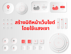
-Create dimensions for website pages by using light and shadows.
-Why do some colors conflict with each other?
-Web testing using Selenium: benefits, challenges, and techniques
-Website design changes 10 years ago vs. today
-Forecasting long-term website design guidelines
-How to make money from the website?
-How do your clients' websites generate income?
-Why isn't there full black in the website design?
-Appropriate number of characters for body text per line.
-How to create an error message when your brand color is red.
-When should you use the grid system?
-When the grid system should not be used
-When should text be aligned to the right?
-When should I use Slab Serif?
-Minimum tap target size on both iOS and Android
-Some formats for displaying search results
-Several formats for filtering search results
-Screen sizes of popular mobile devices
-What percentage of people view your site on mobile?
-When to use bar charts, line charts, and pie charts?
-The difference between saturation and brightness.
-The font on the plaque that Neil Armstrong stranded on the moon
-What's on the plaque of the Pioneer spaceship?
-Difference between inductive and deductive reasoning.
-Selecting user-friendly fonts
-Top 5 Thai fonts used in website design
-Top 5 most downloaded characters
-All keyboard shortcuts in your favorite design apps
-How to design icons that go together
-Default text size on most web browsers, iOS, and in Material design.
-How to create an entire UI using one color.
-How to create an entire UI without colors
-Why are high x-height fonts easier to read?
-At least 5 ways to add text to images.
-WCAG recommended contrast ratio for body text.
-WCAG recommended contrast ratio for headlines
-What Leonardo DaVinci recommends as a first course of action for beginning artists.
-Techniques for using white and black to reduce color contrast on a website
-Principles of good composition
-Where can I find non-stock photos?
-Four reasons why a user's search query might not return any results.
-How to write a call to action
-What should not be included in your design work?
-What does “satisfaction” mean?
-What is most important is beauty or functionality?
-What is Poisson distribution?
-3 reasons why you shouldn't use “carousel”
-The difference between friends and friends on Facebook
-Tradeoff between exploration/exploitation
- Various types of mobile keyboards
- 10 controls you can use instead of dropdowns
-What are supplementary and substitute products?
-Why you shouldn't listen to your users
-Choosing content on the website
-How bad is a good online community?
-How to make a logo that looks only half as good
-The only 5 fonts Massimo Vignelli said he wanted
-There are at least two dozen fonts to be seen.
-Where can I find good inspiration?
-Why don't menus in fancy restaurants show prices in cents?
-Five ways to reduce clutter on a cluttered page
-Difference between Helvetica and Ariel.
-How to ask questions without being biased in your answers.
-What would it be like if it were magic?
-Creator's grid VS Manager's grid
-Tradeoff between line height and line length.
-Things you wouldn't design Even for all the money in the world
[Review of 100 Things a UX/UI Designer Should Know, by E. D. Kennedy ]. (2021, August 7). Retrieved from https://www.learnui.design/blog/100-things-ux-ui-designer-know.html
Leave a comment :
Recent post

2025-01-10 10:12:01

2024-05-31 03:06:49

2024-05-28 03:09:25
Tagscloud
Other interesting articles
There are many other interesting articles, try selecting them from below.

2024-04-25 04:32:21

2024-12-03 02:23:23

2025-02-26 11:32:09

2025-05-28 03:34:33

2023-10-17 04:52:45

2024-04-11 02:06:28

2023-11-03 10:19:40

2023-10-11 09:59:45

2023-09-28 02:46:19
