Selecting user-friendly fonts
2023-10-30 04:35:37
Selecting user-friendly fonts
Website design is an important part of the font on the website. With most communication using letters as the main focus, in addition to designing the website's user interface, having fonts that match the design guidelines is another thing that must be kept in line with the design guidelines. How do we choose the right font style?
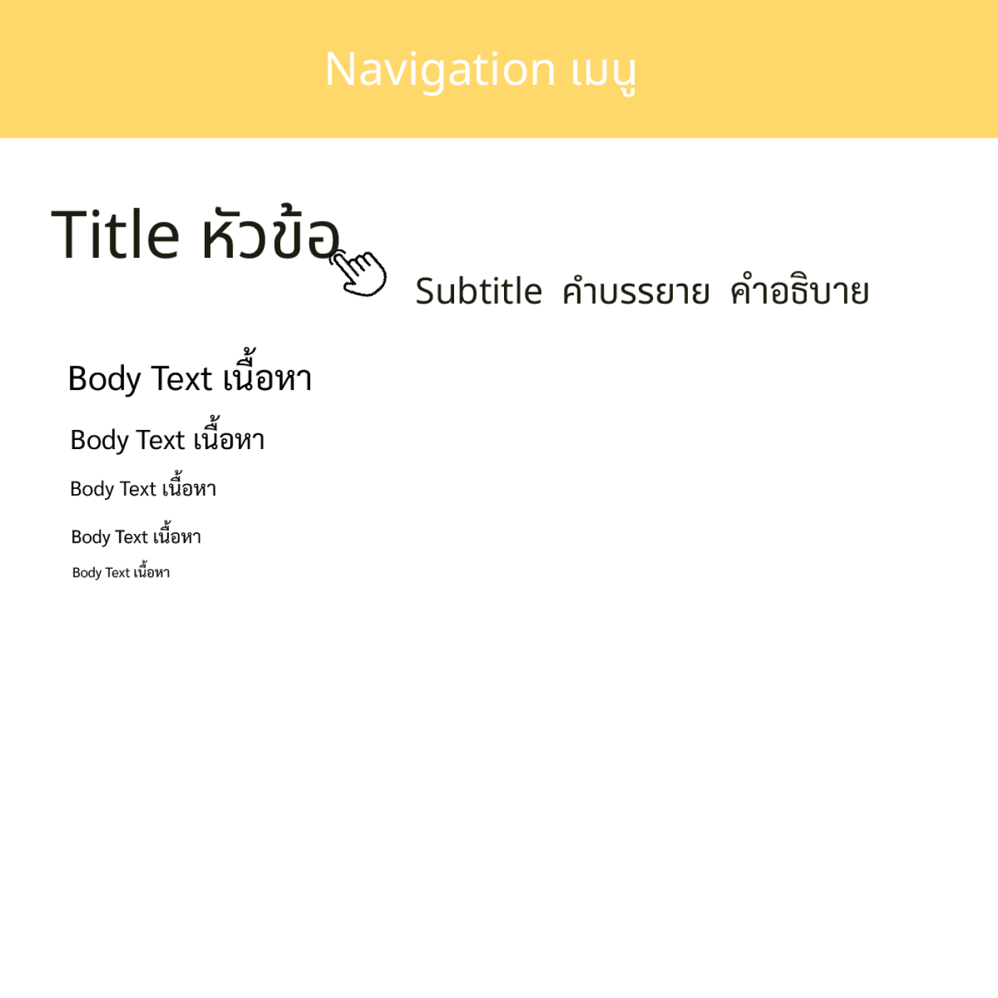
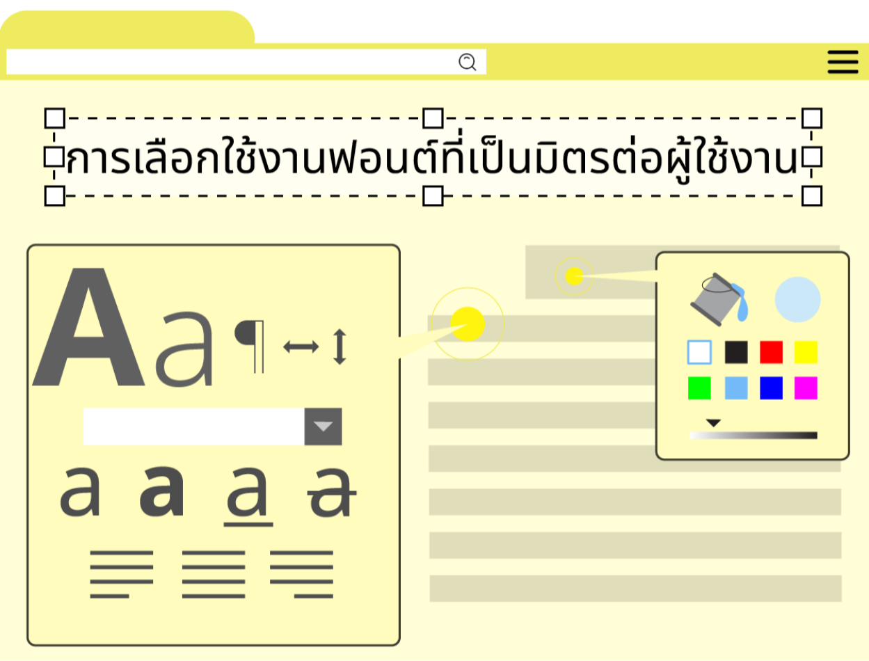
-Choose a font that has clear characteristics and purpose. and consistent with the brand and type of website The use of fonts must be separated into 4 parts: Navigation, Title, Subtitle, and Body Text.
1. The Navigation section must be a clean and modern font.
2. Title, it is recommended to use a Sans Serif font similar to Navigation, but with a larger font size than the rest so that it is the point that the user will read first.
3. Subtitle section, the fonts in this section can be used in both Sans Serif (font without head) and Serif (font with head).
4 . Body Text uses Serif font (font with head) because it has many letters. Using headed fonts will make website users more comfortable with the eyes.
-Use fonts that are different and related. If using more than one font Use serif fonts for topics and non-serif fonts for content. In general, Serif fonts are letters with small strokes. Attached to the end of the twine. This makes it easier to read. Because they create a connection between letters, serif fonts are elegant, classic, and formal. Therefore, it is suitable for use in documents that need to convey a clear meaning. and readers who are interested in content such as newspapers, books, and academic articles. Sans-serif fonts are letters that do not have a line attached to the end of the main line. Which has a simple, clean, and modern look, therefore suitable for use in media that wants to convey a relaxed, friendly, and easily accessible feel, such as logos, headlines, and website links. However, using Serif or Sans-serif fonts is not. Bound by the belt rule Because nowadays there is a combination and development of new letters. To be suitable for use in each situation
-You should use a font size that is not too small or too large. So that users do not have to adjust the size or scroll the screen frequently. The recommended font size for websites is 16 px. Use a larger font size for headings and a smaller font size for content. To make it clear to readers what is important, use font colors that contrast with the background. So that the reader does not have to strain or strain their eyes. For example, if the background is dark, use a bright font color and use different font colors. So that readers can see which things are related, for example, if information is divided into categories, use the same font color for information in the same category.
- Line spacing should be used. (Line-height) that is just right so that reading doesn't look like the same story. or looks too dense which has the following general principles
1. Use line spacing appropriate to the font size. Normally, you should use line spacing that is greater than the font size. For example, if the font size is 16px, line spacing should be no less than 16px so that the text is not confused.
2Use line spacing that is comfortable for reading. Normally, use line spacing that is neither too large nor too small. So that readers don't have to move their eyes up and down too much, for example, if the text is very long. Line spacing that is not too small should be used. so that readers are not confused
3. Use line spacing that is consistent with the purpose of the communication. Normally, line spacing should be used that affects capturing the main points of the message, for example, if the message is the main topic. Longer line spacing than normal text should be used. To make it easy for readers to notice
Leave a comment :
Recent post

2025-01-10 10:12:01


2024-05-31 03:06:49

2024-05-28 03:09:25
Tagscloud
Other interesting articles
There are many other interesting articles, try selecting them from below.

2023-11-21 01:12:50

2024-04-12 05:10:37

2023-09-05 09:15:46

2023-09-11 03:37:50

2024-08-19 02:53:39


2025-03-10 01:39:46

2023-12-13 03:31:03

2024-04-30 03:29:35