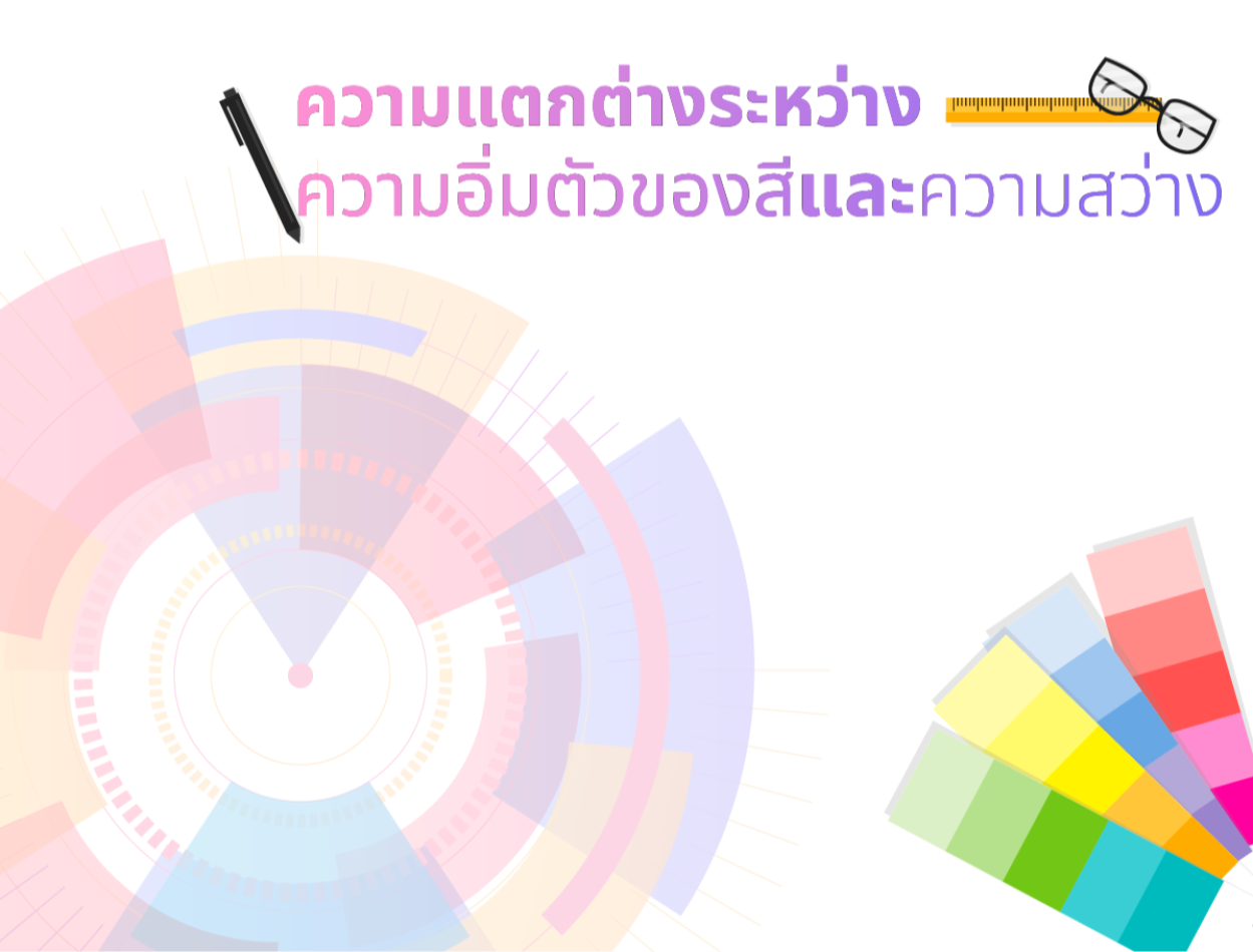
Difference Between Saturation and Brightness
2023-10-26 05:02:33
Difference Between Saturation and Brightness
Website design requires the use of color as an important component, which determines color and color value. Being a good designer requires choosing between saturation and brightness. Saturation and brightness are characteristics used to describe colors. By saturation, we mean the intensity of the color. or the amount of gray mixed in the paint Brightness refers to the level of light reflected from a color. or the amount of white or black mixed in a color. For example, a highly saturated red is a deep red. But if the saturation is reduced Will it be pink or pale red? which has gray mixed in Reds with high brightness are light reds. But if the brightness is reduced Will it be dark red or red-black? which has black mixed in

So which method will we choose?
Choosing between saturation and brightness depends on the goals and content of your website. For example, if you want your website to stand out and be dynamic, Saturation can be increased to make colors sharper. But if you want your photos to look aged or toned, if you want them to look bright and clear. You can also lower the saturation value to make it grayer. We can increase the brightness value to make the image brighter. But what if you want your photos to look dark or mysterious? You can lower the brightness value to make the image darker.
Adjusting the brightness of an image serves many purposes, such as:
-To make the picture look bright and clear When the picture is underexposed or too dark
-To make the picture look dark or mysterious When the picture is overexposed or too bright
-To make the picture look old or vintage When the picture is unevenly bright
-To make the picture look like a scene in a movie or cartoon. When the image has a brightness that is different from reality
-To make the picture look like art or a creative work. When the picture has a unique brightness
Adjusting the saturation of an image serves many purposes, such as:
-To make the picture look bright and bold When the picture has few colors or is too pale
-To make the picture look faded and toned When the picture has too many colors or is too bright
-To make the picture look old or vintage When the picture has uneven colors
-To make the picture look like a scene in a movie or cartoon. When the picture has a color that is different from reality
-To make the picture look like art or a creative work. When the picture has a unique color
Website design requires color as an essential element, which determines color and color value. Being a good designer requires choosing between saturation and brightness. This depends on the purpose of the website that you want to convey. How do you give it to users?
Leave a comment :
Recent post

2025-01-10 10:12:01

2024-05-31 03:06:49

2024-05-28 03:09:25
Tagscloud
Other interesting articles
There are many other interesting articles, try selecting them from below.

2024-03-12 02:40:20

2024-02-15 03:21:09

2025-04-17 10:32:59

2023-11-03 10:19:40

2024-01-11 04:45:59

2024-09-17 01:32:07

2023-10-11 10:53:40

2023-10-20 09:37:23

