
Create dimensions for website pages by using light and shadows.
2023-10-17 04:52:45
Create dimensions for website pages by using light and shadows.
The first impression you make on your website is a beautiful website. There are many techniques to make your website more attractive. One of them is the use of shadows to create dimension to the website by making it not look too flat. This must come from an understanding of light incident to determine the direction of light. Reducing shadows according to the distance of light or using tools to help determine the direction
Tools to help determine direction https://shadows.brumm.af
The functionality of the website is defined by code that can be copied and has five sidebar toolbar sections.
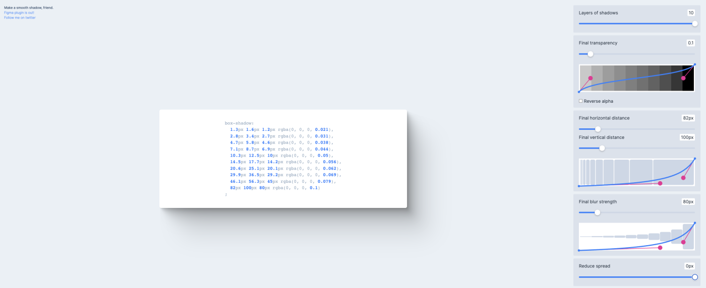
Layers of shadows section, which can create a maximum of 10 layers

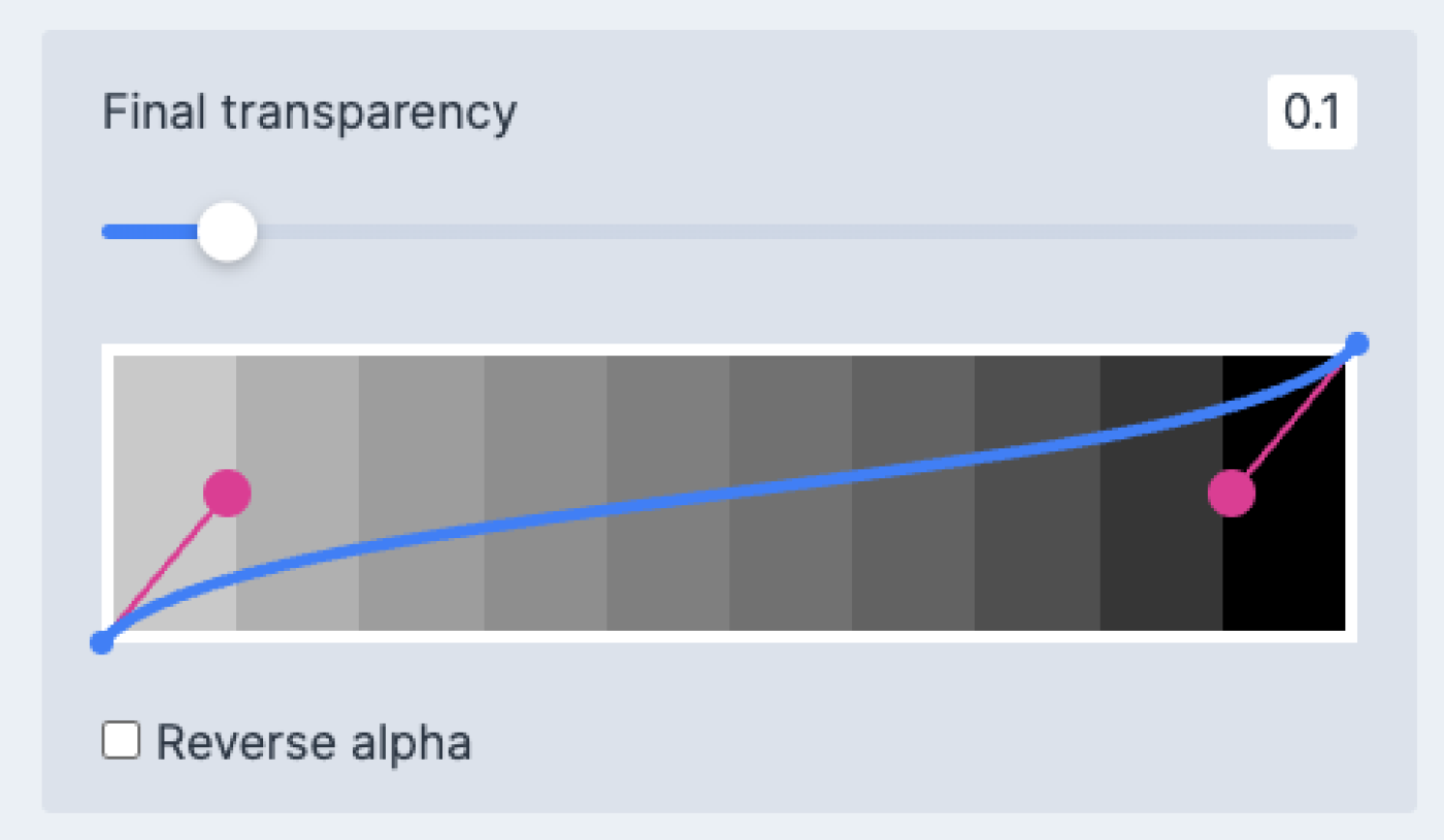
Final transparency is the part that determines the intensity of the shadow.
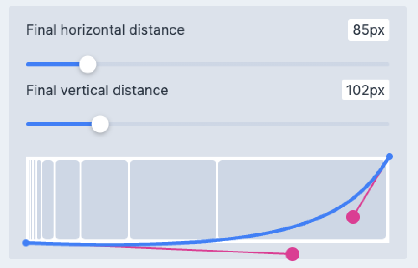
The final horizontal distance and final vertical distance are the parts that determine the direction of the shadow. both vertical and horizontal The distance between the shadow and the object
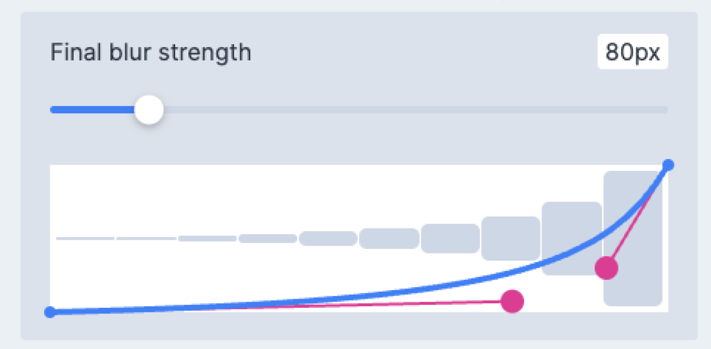
The final blur strength is the part that determines the intensity of the shadow.
The Reduce spread section determines the distance between the layers.

Once you have set the desired shadow value, you can copy the code.
And in addition, there is another way that is to use color to create dimension to the website page. to provide contrast between highlights and textures or shape and space Using reflection To make interesting graphics
There are advantages and disadvantages to using shadows in web page design:
strength
-Using shadows can help your website look three-dimensional, deeper, and dynamic.
-Using shadows can help highlight highlights. or the part that you want users to be interested in
-Using shadows can help create the atmosphere, mood, or feeling you want to convey to the user.
-Using shadows can help increase the beauty, interest, and distinctiveness of graphics, images, or text.
weakness
-Using inappropriate or excessive shading can make a website look distracting, unclear, or unrealistic.
-Using shadows may reduce file size, loading times, and website performance.
-Using shadows can make your design not noticeable to users. This is because shadows may not be displayed the same on different devices.
-Using shadows may make text more difficult for users to read. Because the contrast of colors (contrast) is not enough.
Create a dimension to your website using light and shadow. Using shadows can help highlight highlights. The last horizontal distance and the last vertical distance determine the direction of the shadow. The first impression you make on your website is that it looks beautiful.
Leave a comment :
Recent post

2025-01-10 10:12:01

2024-05-31 03:06:49

2024-05-28 03:09:25
Tagscloud
Other interesting articles
There are many other interesting articles, try selecting them from below.

2025-04-03 03:03:43

2024-04-11 02:14:04

2024-01-05 03:02:18

2024-02-19 04:57:03
2023-11-02 09:24:43

2024-08-06 10:34:57

2024-10-10 10:45:27

2023-10-17 03:13:43

2024-10-28 01:54:10
