Principles of website composition
2023-11-03 09:16:36
Principles of website composition
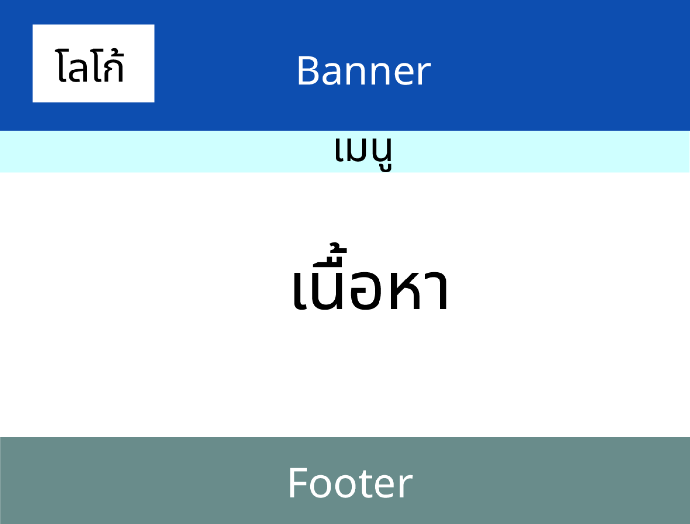
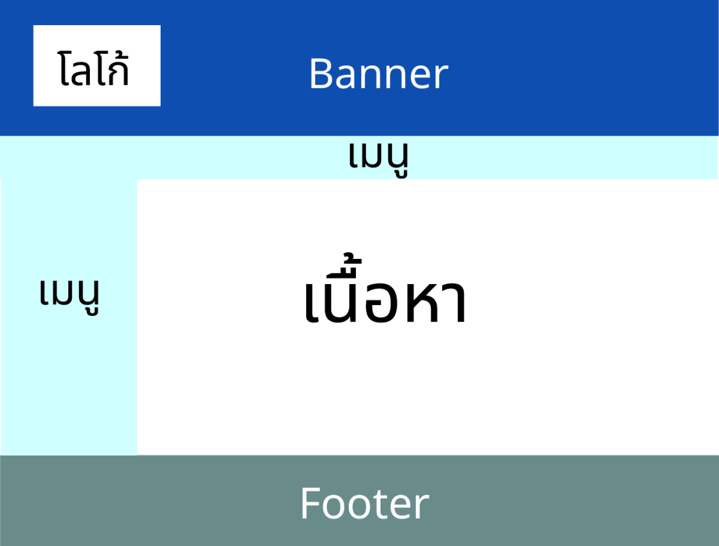
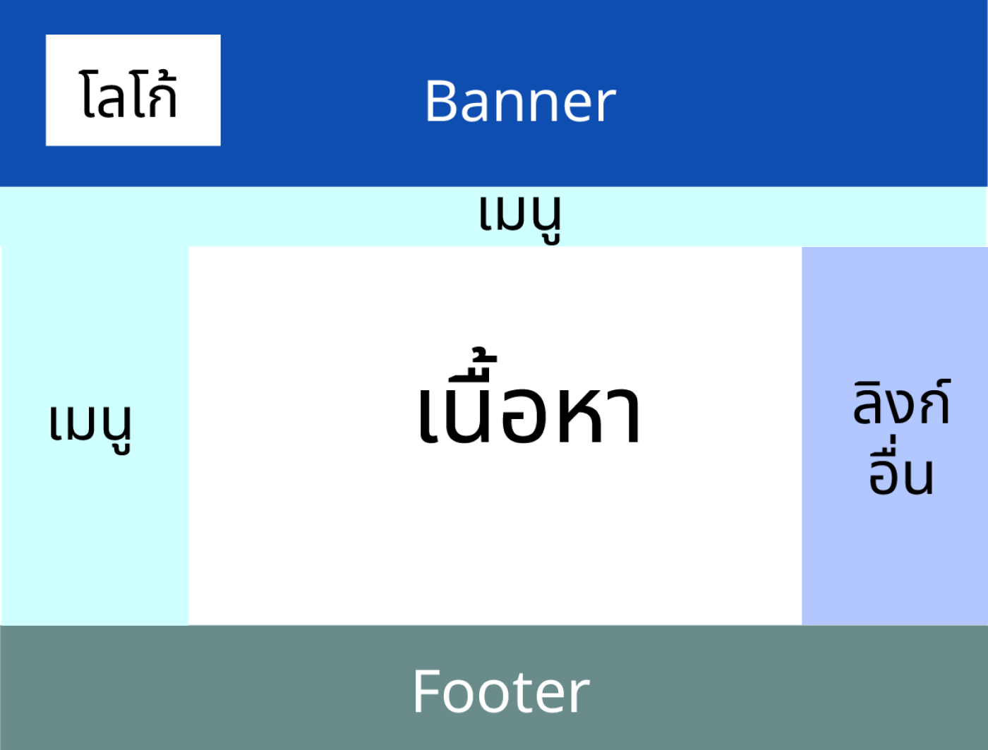
Web design principles are important for those who want to create a quality website. and can communicate effectively with users There are 4 principles for organizing website elements:
1.Visual hierarchy is the arrangement of information to suit the user's priorities using size, color, shape, and positioning. To help users quickly access the information they need.
Important website elements are as follows:
-Content is what users access the website to find. and communicate the message that the creator wants to convey to the user. The content should be of quality. and appropriate to the website's goals
-Design is the arrangement of various elements. To be beautiful and consistent with the principles of website composition The design should make it easy for users to understand, access, and use the website.
-Programming It is using computer language. to create a function and the operation of the website Programming should make the website capable. and efficiency in responding to user needs
-Updating is taking care of, adding, editing, and improving the website to be up to date. and there are no errors Improvements should make the website reliable. and does not escape the attention of users


2.white space is the space between various elements. To make the website concise and not cause the user to feel confused, such as between letters Between the lines between pictures, or between different parts of the website
Free space has many uses, such as:
-Helps the website look clean, concise, and balanced.
-Helps the content and important elements stand out and be easier to understand.
-Helps the user to have visual comfort and not feel confused.
-Helps users have better vision and recognition.
-Helps users have efficient travel and navigation.
Using space doesn't mean it's useless. But it is an area that is managed reasonably and correctly. To create a positive impact on the design and usability of the website.
3. Chunking is the division of large amounts of information into smaller units and is a memory technique that helps you organize information that has similar or related characteristics into larger units called chunking. chunks, which will help you remember more information more easily. For example, if you need to remember a 10-digit phone number, such as 0812345678, you might divide it into chunks by adding a dash (-) to 081-234-5678 or 08-. 1234-5678 and memorize each chunk indefinitely to help users classify and remember information more easily.
4.color is choosing a color that is appropriate for the website. and can convey the mood, atmosphere, and message you want to convey to the user
There are many factors involved in using color in website design.
-main color based on your logo, brand, or other website elements
-color scheme and shades using online tools such as Muzli Colors, Adobe Color CC, Colormind, etc.
-The 60-30-10 rule is a rule that recommends using 60% main color, 30% secondary color, and 10�cent color to keep the website balanced and uncomplicated.
-contrast to make the website clean and easily readable, such as using complementary colors or colors with different brightness or saturation.
-working with images to make images compatible with the website's color scheme, such as converting them to Grayscale, adjusting image vibrancy, using natural colors, or creating gradients.
Leave a comment :
Recent post

2025-01-10 10:12:01

2024-05-31 03:06:49

2024-05-28 03:09:25
Tagscloud
Other interesting articles
There are many other interesting articles, try selecting them from below.

2023-12-13 03:01:00

2025-03-12 10:38:46

2025-04-18 06:57:56

2024-08-19 11:57:51

2024-03-29 10:32:46

2024-03-22 03:10:58

2024-05-15 04:24:59

2025-05-30 06:53:26

2025-05-12 03:48:15
