Contrast ratio WCAG
2023-11-03 10:19:40
Contrast ratio WCAG
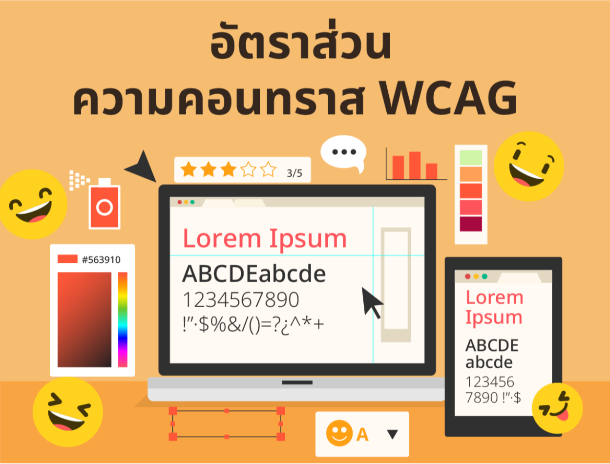
The contrast ratio measures the difference between the colors of text and the background used in website design. To provide users with vision problems or various colors Can read text more easily Contrast ratios range from 1:1 (no difference) to 21:1 (maximum contrast). The higher the ratio, the brighter the contrast. This indicates that there is a difference between the color of the text and the background.
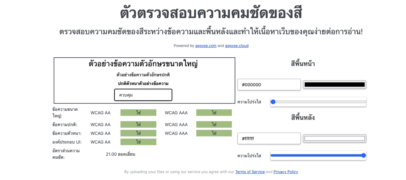
The contrast ratio measures the difference in brightness between two colors used in the text and background. Using the formula as (L1 + 0.05) / (L2 + 0.05) where L1 is the brightness value of the lightest color and L2 is the brightness value of the darkest color. The contrast ratio ranges from 1 (no difference) to 21 (maximum contrast). The higher the ratio, the higher the contrast. The more it shows a clear difference between the text and the background.

A contrast ratio of at least 7:1 for normal text and at least 4.5:1 for large text is required to qualify for AAA.
Web Content Accessibility Guidelines (WCAG) is a set of web accessibility guidelines established by the World Wide Web Consortium (W3C) to improve the accessibility of websites for users with disabilities. The WCAG contains requirements for appropriate contrast ratios. For text and text images, there are 3 levels: A, AA, and AAA, with AA being the level most sites treat.
WCAG defines success criteria regarding the contrast ratio for text and its images as follows:
-Contrast (Minimum): This is an AA-level criterion that requires display text and images to have a contrast ratio of at least 4.5:1 unless large text must have a ratio of at least 4.5:1. 3:1
-Contrast (Enhanced): This AAA standard requires text and images to have a contrast ratio of at least 7:1 unless large text has a ratio of at least 4.5:1.
-Non-text Contrast: This is an AA-level criterion that requires non-text elements such as buttons, icons, and graphs to have a contrast ratio of at least 3:1 with the surrounding background.
The 4 principles are
-Perceivable: Content on the website must be perceivable through sight, hearing, or touch.
-Operable: Content on the website must be accessible via keyboard. or other equipment And there is nothing that annoys users.
Understandable: Content on your website must be communicated and consistent with user expectations.
Robust: Website content must be compatible with current and future technologies.
The 12 guidelines for practice are:
- Prepare textual information (Text) instead of content that has other formats.
- Prepare descriptive text that matches the events in the multimedia media.
-The design of the structure and content must be able to work independently of each other.
Ensure that the image and background (colors and sounds) are different enough to allow users to distinguish them.
-Every operation must be able to be used from the keyboard.
-Prepare enough time for reading. or any action of information
-Do not create content that may cause seizures.
-Increase convenience for users to easily search between information.
-Use appropriate and clear language.
- Keep content and work consistent.
-Help users prevent and correct errors.
-Content must be interpretable by assistive technology.
In summary, it measures the difference between the color of text and the background on a website. The contrast ratio affects web accessibility for visually impaired or color-impaired users. Based on the Web Content Accessibility Guidelines (WCAG) set by the World Wide Web Consortium (W3C).
Leave a comment :
Recent post

2025-01-10 10:12:01

2024-05-31 03:06:49

2024-05-28 03:09:25
Tagscloud
Other interesting articles
There are many other interesting articles, try selecting them from below.

2024-08-26 09:43:13

2023-11-22 02:16:10

2023-12-12 04:45:33

2023-11-22 11:10:42

2023-09-05 09:45:04

2024-11-06 11:24:26

2024-01-05 03:55:22

2024-09-17 02:19:52

