
Chart usage in website design
2023-10-25 05:28:43
Chart usage in website design
In addition to using images in design Website is another thing that can make your website more attractive. is to use charts on the website This is another option that can attract the attention of users in cases where numbers must be displayed. or survey results And it will make your website look more professional.
Benefits of using charts in website design
-Charts can be used to create website structure. It is a tool for organizing content and displaying it. where you will be able to specify the website you want Order of use Links to each web page are possible.
-Charts can be used in infographic design, which is another way to make your website interesting and easy to understand. You can design using various types of charts. This will help website users to understand the content quickly.
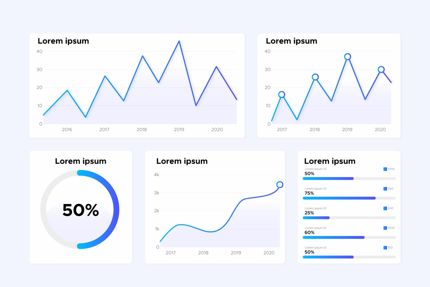
Chart type
There are many ways to use charts. This depends on the type of information and the purpose of its presentation. For example:
-If you want to compare values for variables such as sales, products, or countries, you might use a column, bar, or pie chart.
-If you want to display elements of data, such as population proportions or budgets, you might use pie charts, donut charts, or pie charts.
-If you want to show the distribution of data, such as age range, test scores, or income, you might use a scatter chart, funnel chart, or histogram chart.
-If you want to show relationships between variables, such as changes in data over time. or the relationship of various variables You may use a line chart. area chart or scatter chart
Ways to design interesting charts
1. Choose a chart type that is appropriate for the information you want to present. Such as using bar charts to compare daily usage or sales.
2. Choose colors that are appropriate for the data. This is important for the chart to capture the user's attention well. The colors and color combinations must harmonize (not clash) with each other so that your chart looks organized. Does not disturb the eyesight or confuse the audience
3. Add icons or drawings within the chart. To make the chart stand out and be more interesting
4. Reduce the complexity of the chart. Such as reducing borders, and grid lines, and reducing the number of colors used. Avoid using shadow effects.
In conclusion, when using charts in website design, you must take into account the use of charts to match the data display. Chart elements are organized in an orderly, easy-to-understand, and uncomplicated manner. The design method is up to the web designer to design in which direction. To communicate with users as best as possible
Leave a comment :
Recent post

2025-01-10 10:12:01


2024-05-31 03:06:49

2024-05-28 03:09:25
Tagscloud
Other interesting articles
There are many other interesting articles, try selecting them from below.


2024-03-29 09:41:46

2024-02-19 05:37:43

2025-03-10 10:29:46

2023-10-17 03:51:31


2025-05-09 03:40:39

2024-11-06 10:59:12

2023-10-12 05:42:28