Add elegance to your website by using the Didone font.
2023-10-20 09:09:22
Add elegance to your website by using the Didone font.
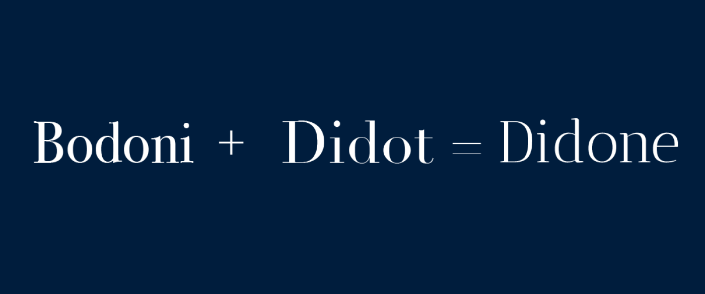
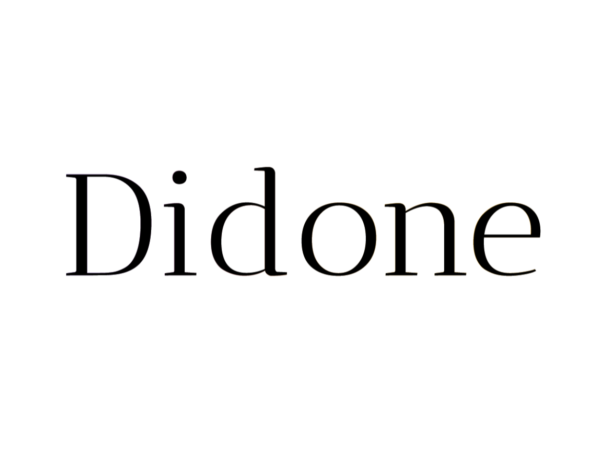
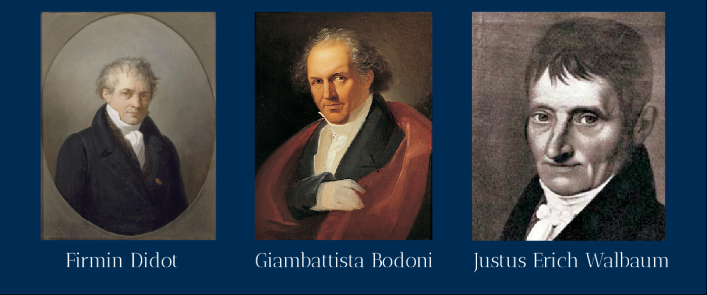
Didone is a serif typeface created by Firmin Didot, Giambattista Bodoni, and Justus Erich Walbaum in the late 18th century to showcase the quality of typography and printing technology of the time. Because the font will have a distinctive feature.
-Serifs are narrow and do not have hairlines (Serifs have the same width throughout).
-vertical weight axis (The part where the bold letters are located)
-The difference between thick and thin lines is clear. (The sleeping part of the letter is thin compared to the standing part.)
-Some of the endpoints of the lines show the ball. (Some lines end with a teardrop or circle shape, not a square serif.)
-Appearance without "modern" decorations
“And how do you use it on the website?”
Designing a website with Didone is both interesting and challenging. Didone is a font that is characterized by strong contrast between thick and thin lines and narrow, square serifs. Using this font in website design requires taking into account factors such as:
-Appropriateness of the font to the website's goals. Didone font is suitable for websites that want to convey completeness, beauty, and outstandingness, especially in the topic section. or the message you want to emphasize
-Readability The Didone font may not be legible in small sizes or limited spaces. Because very thin lines disappear into the background. Therefore, use a large enough size and adjust the contrast appropriately.
-Consistency in the use of fonts The use of the Didone font should be consistent with the use of other fonts on the website so as not to create confusion or unbalance. You should choose fonts that have similar characteristics. Or there is not much difference
Didone is a typeface that is characterized by sharp contrast between thick and thin lines and narrow, angular serifs. Using this font in website design takes into account factors such as the suitability of the font to the website's goals. clarity of reading and consistency in the use of fonts
In general, the Didone font is suitable for websites that want to convey a rich, beautiful, and striking message, especially in the subject area. or the message you want to emphasize, such as a company website, store, media, education, etc.
Using the Didone Font in Website Design The Didone font is a type of serif font that is characterized by a clear contrast between thick and thin lines. The use of the Didone font in websites that want to convey completeness, beauty, and outstandingness, especially in the topic section. You should use a size that is large enough. To ensure that thin lines don't disappear into the background, adjust the contrast appropriately to differentiate between thick and thin lines. Choose a font that is consistent with the Didone font so it doesn't look confusing or unbalanced.
Leave a comment :
Recent post

2025-01-10 10:12:01


2024-05-31 03:06:49

2024-05-28 03:09:25
Tagscloud
Other interesting articles
There are many other interesting articles, try selecting them from below.

2023-11-09 03:11:19


2023-09-25 04:09:33

2025-03-13 05:03:55

2023-12-13 03:31:03


2024-04-19 03:03:34

2025-02-25 01:26:46