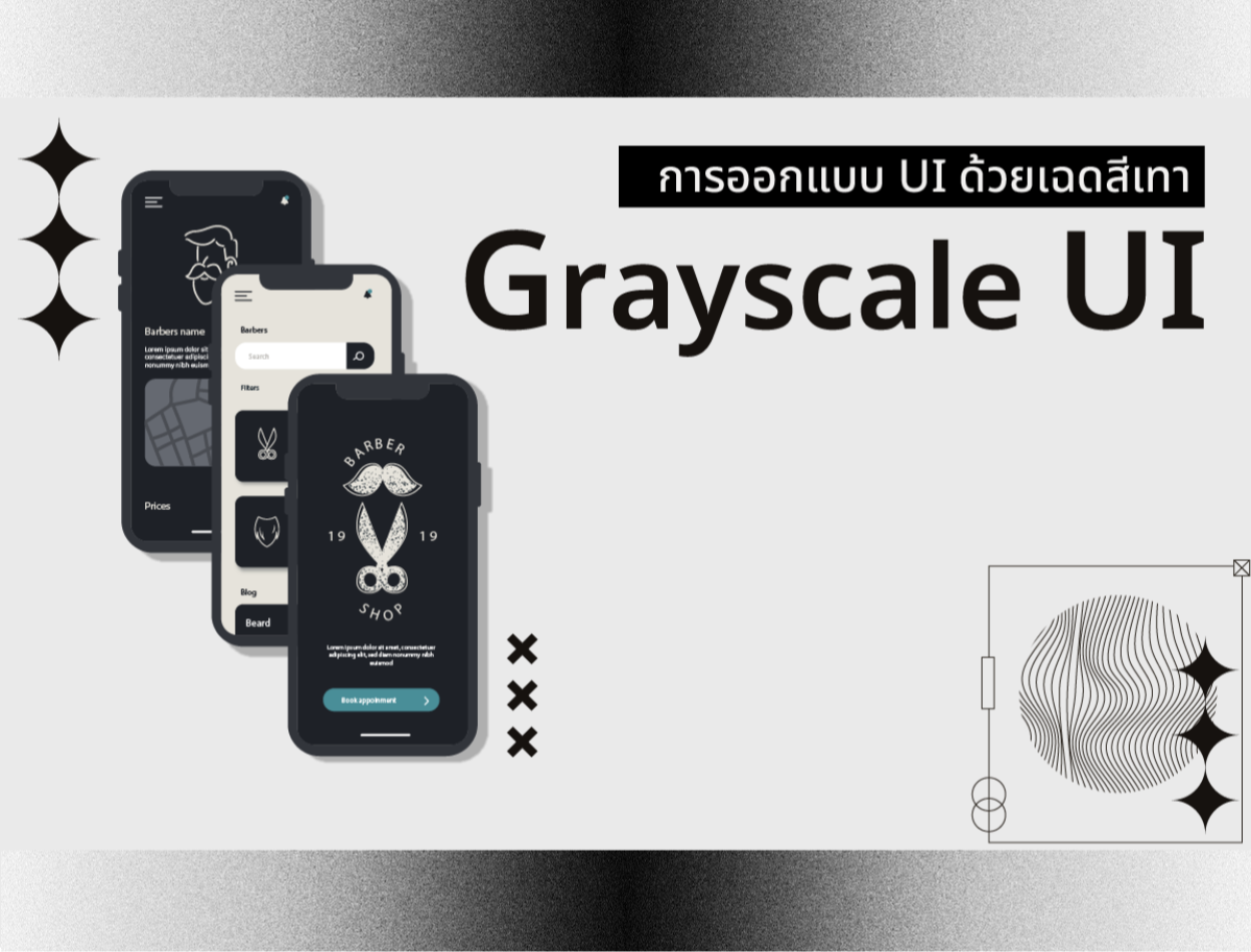
Grayscale UI: Designing the user interface in shades of gray.
2023-11-01 02:54:29
Grayscale UI: Designing the user interface in shades of gray.
What is Grayscale UI?
It is a user interface design using different shades of gray. Be it white, black, or any shade of gray in between.
What are the benefits of creating grayscale UI? It is useful in many ways such as
Increase emphasis and clarity of important information
Reduce complexity and color noise
Add balance and beauty to the design
Increases customization and compatibility with other themes.
How do I create a grayscale UI? Several steps can be taken, such as:
-Choose a shade of gray that suits the tone of the design.
-Use contrast ratio to check the clarity of text and symbols.
-Use texture, shape, shadow, gradient, and animation to add variety and interest.
-Test grayscale UI on various devices. to improve efficiency
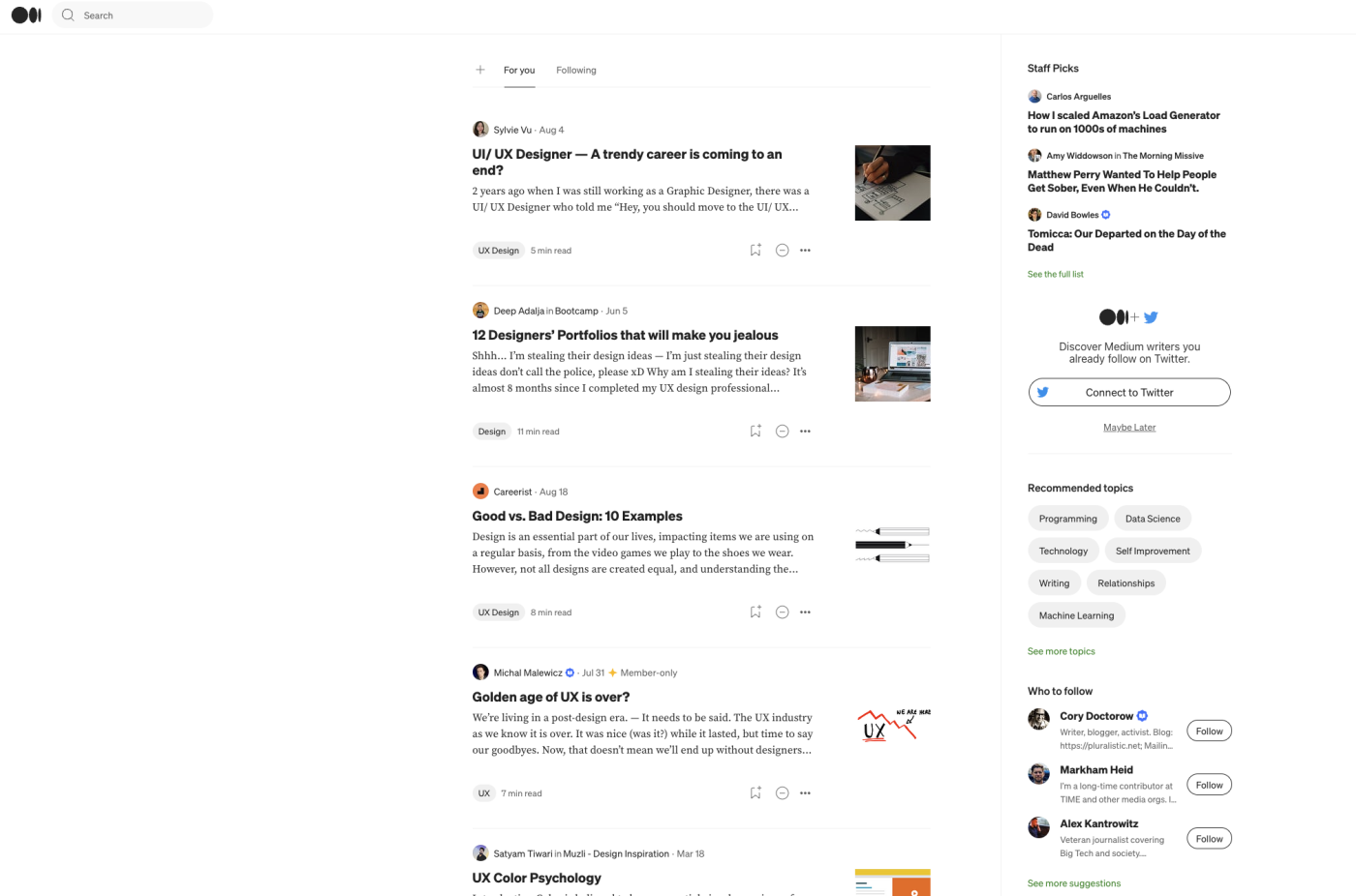
One example is the website of [Medium], an online article-writing platform. Medium uses a grayscale UI to highlight the content of the article. and reduce distractions from unnecessary colors. Medium uses a bright shade of gray in the background. and dark shades of gray in the text to create a high contrast ratio and make it easier for readers to read. Medium also uses textures such as underlining, italic, and bold to add variety and clarity to the text.
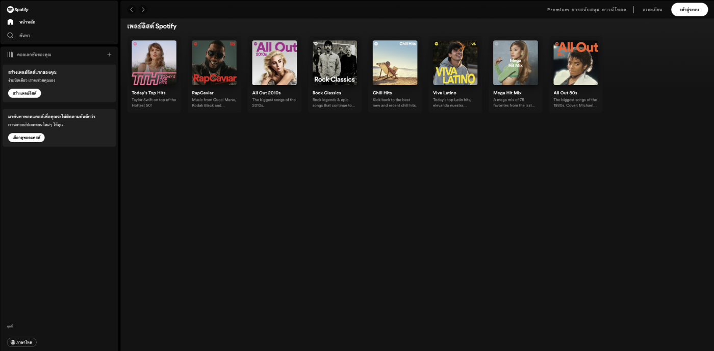
The second example is the [Spotify] app, an online music listening platform. Spotify uses a grayscale UI to emphasize the visibility of the song's cover art. And the Spotify music playback controls use a dark shade of gray in the background. and bright shades of gray in text to create a high contrast ratio and better visibility for users. Spotify also uses shapes such as circles, squares, and rectangles to add variety and beauty to the design.
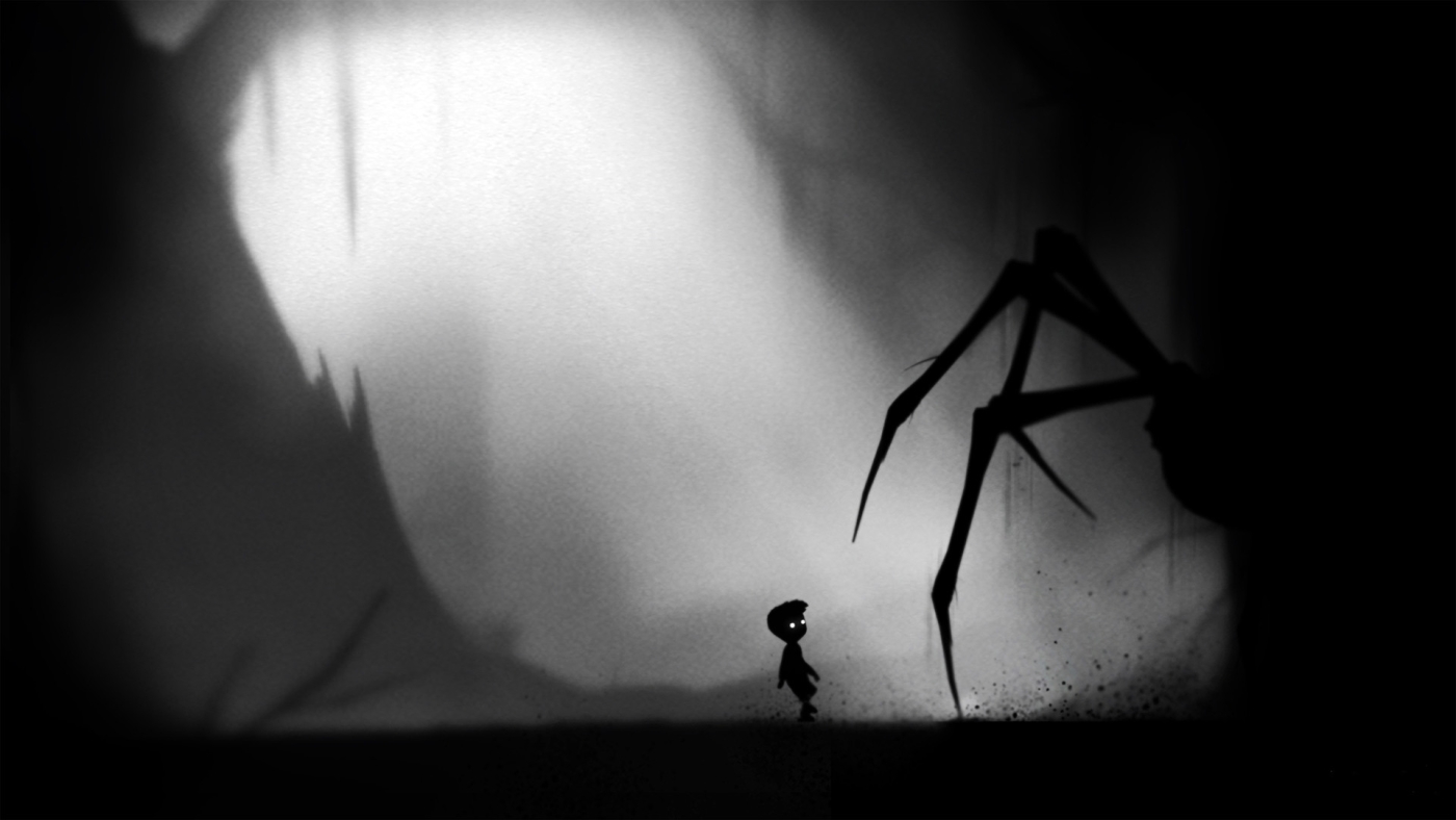
A third example is [Limbo], a platformer adventure game. Limbo uses a grayscale UI to create a dark, sleepy, and mysterious atmosphere. Limbo uses an unlimited number of shades of gray to create gradients, shadows, and blurs to create depth. And different levels Limbo also uses animation such as parallax scrolling, motion blur, and flickering light to increase the interest and excitement of playing.
From the example above We can see that grayscale UI affects the user experience in various ways. Depending on the designer's objectives and needs, using a grayscale UI may add emphasis, clarity, balance, beauty, and customizability. and compatibility with other themes But it may reduce the brightness, fun, variety, and individuality of the design.
Therefore, the use of grayscale UI is a matter of careful consideration. to get results that are suitable for users
Leave a comment :
Recent post

2025-01-10 10:12:01


2024-05-31 03:06:49

2024-05-28 03:09:25
Tagscloud
Other interesting articles
There are many other interesting articles, try selecting them from below.

2024-11-13 05:24:55

2024-03-08 04:48:27

2023-09-06 11:56:11

2024-09-10 11:09:07

2023-11-02 11:11:27
2023-09-11 03:37:50

2024-05-02 05:54:22

2024-12-03 01:51:43

2025-05-30 03:20:39