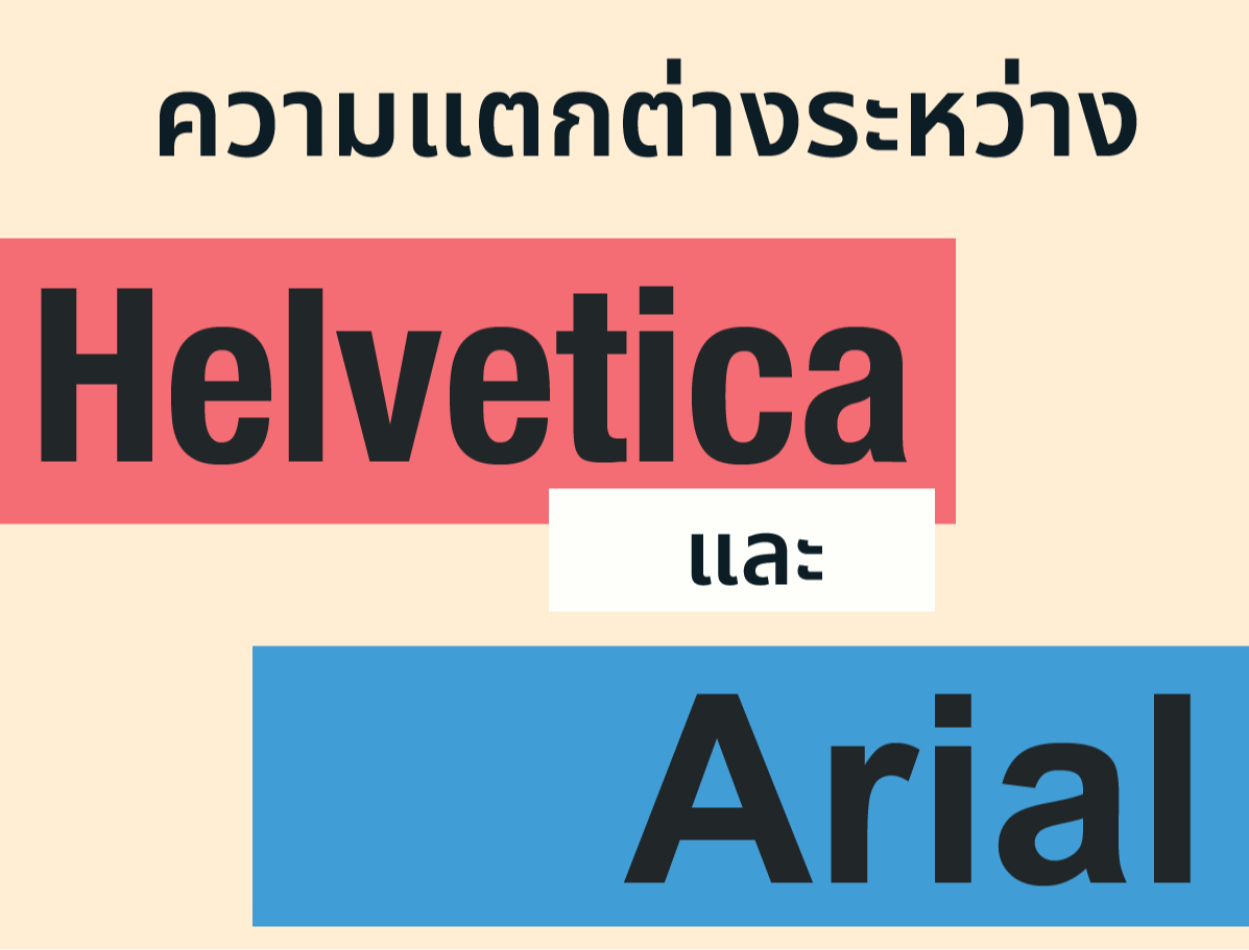
Difference Between Helvetica and Ariel
2023-11-22 11:17:41
Difference Between Helvetica and Ariel
Helvetica and Ariel are the names of sans-serif typefaces. It is characterized by the absence of dashes or additional decorative lines at the ends of letters. Make it look simple and clean. But what are the differences between Helvetica and Ariel? This article will attempt to explain the differences between Helvetica and Ariel in several aspects, including history, characteristics, and uses.
record
Helvetica was designed in 1957 by two Swiss designers, Max Miedinger and Edouard Hoffman. Stick to designing a simple, clean font set. It is a set of letters that allows words to express their full potential. without stealing the scene Helvetica's original name was Neue Haas Grotesk, but it was changed to Helvetica in the 1960s to make it easier to remember and pronounce. The name Helvetica comes from Helvetia, the Latin name for Switzerland.
Ariel was designed in 1982 by two British designers, Robin Nicholas and Patricia Saunders, with the idea of creating a character set that It is similar in appearance to Helvetica. But there are slight differences. For compatibility with low-resolution printers and computer screens. The name Ariel comes from the word Arial, a word used to refer to free flight.

nature
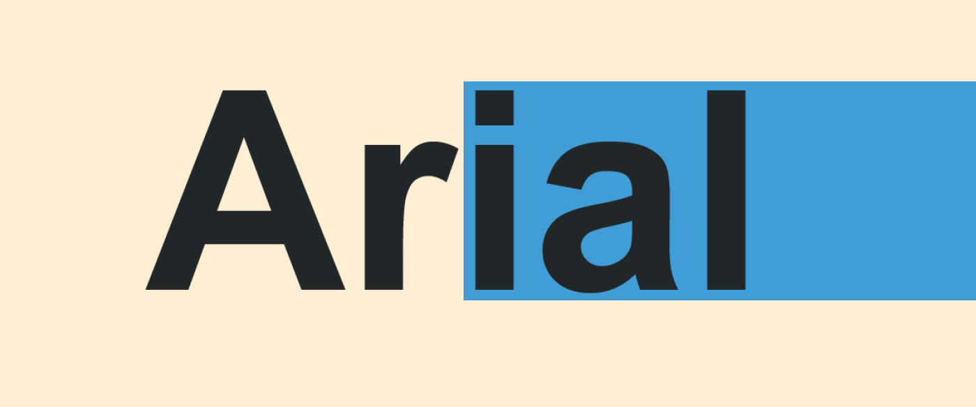
Helvetica and Ariel are very similar in appearance. But there are differences in some details as follows:
-Helvetica has letter lines that are all the same thickness. As for Ariel, the lines of the letters are unevenly thick. In particular, the corners of letters such as C and G have lines that are thicker than other lines.
-Helvetica has rounded ends of letters. Ariel has a pointed tip. In particular, the A and R letters have sharp ends that make them look like they have their legs cut off.
-Helvetica has a Q with a straight line descending into a circle. Ariel has a Q with a straight line going down outside the circle.
-Helvetica has an R with a straight line descending into a circle. Ariel has an R with a straight line going down outside the circle.
-Helvetica has a letter T that is as wide as the height of the letter. Ariel has a T with a width less than the height of the letter.
-Helvetica has a letter G with a straight line connecting the circle. Ariel has a letter G that does not have a straight line connecting the circle.
Leave a comment :
Recent post

2025-01-10 10:12:01


2024-05-31 03:06:49

2024-05-28 03:09:25
Tagscloud
Other interesting articles
There are many other interesting articles, try selecting them from below.

2024-04-08 11:54:09

2023-12-12 05:39:57

2023-10-26 05:02:33

2023-11-03 09:16:36

2024-04-10 05:46:39


2024-02-21 04:37:44

2023-11-01 11:43:39

2024-08-07 09:51:16