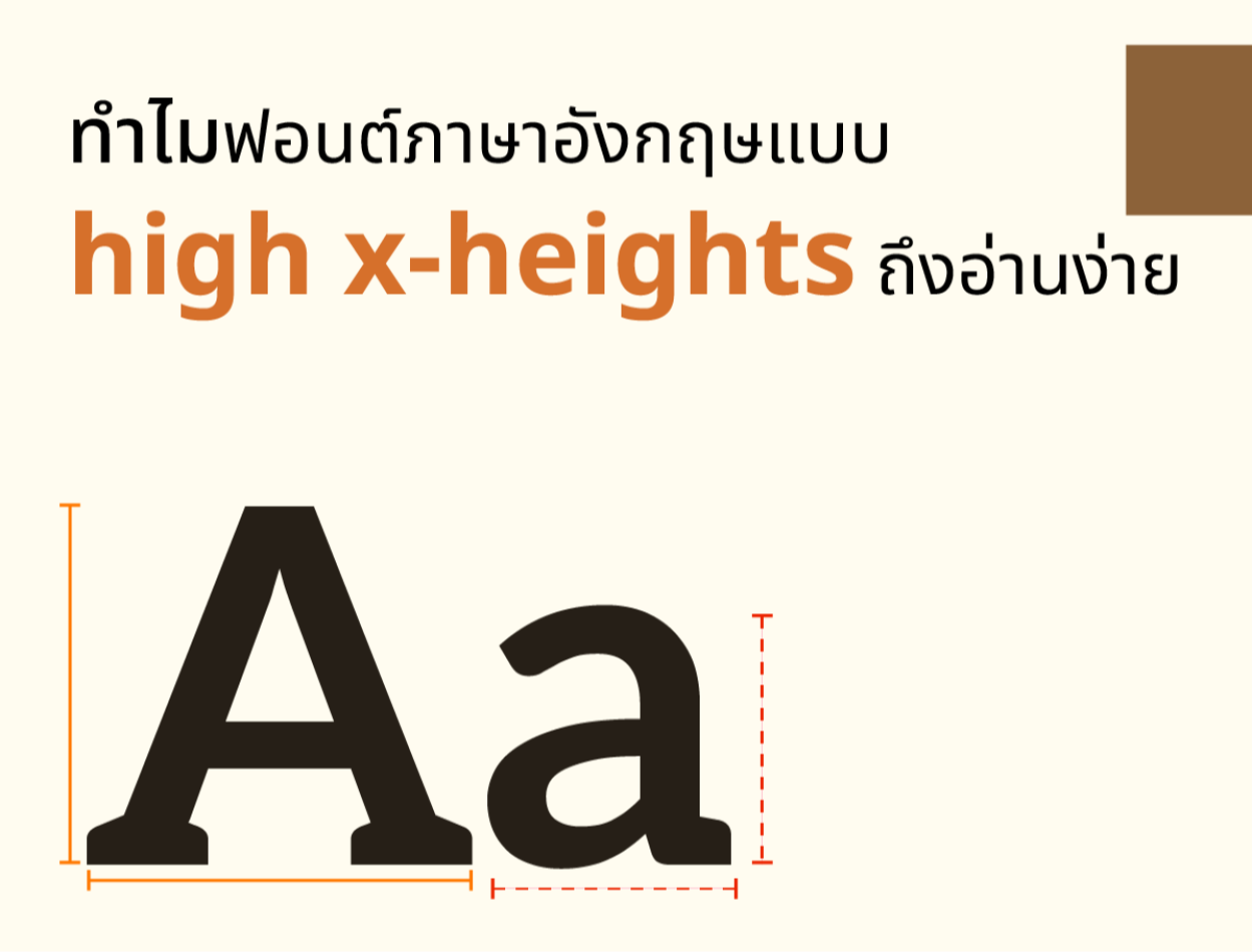
Why are high x-height English fonts easy to read?
2023-11-02 09:24:43
Why are high x-height English fonts easy to read?
High x-height English fonts are fonts that have the height of the lowercase letters compared to normal font sizes. This type of font makes it easier to read in cases where the font size is small. Because letters with spaces will be thicker and help to see the shape of the letters more clearly.
The advantages of high x-height fonts are:
-Makes it easier to read small text.
-Ideal for reading on high-resolution screens.
-Helps the text look full and balanced.
The disadvantages of high x-height fonts are:
-Makes large text look like all caps.
-Reduced ability to distinguish between uppercase and lowercase letters.
-Not suitable for reading on low-resolution paper.
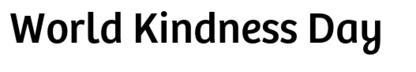
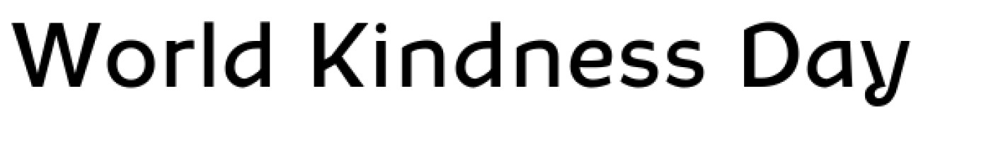
Example of a high x-heights font
-Bree CYR: A sans serif font with friendly, fun letter shapes.
-Cy Grotesk: A sans serif font with a very high x-height and a simple, neat letter shape.

-Aleksa: A serif font with the x-height the same as the height of the uppercase letters. And the shape of the letters is classic.
-Chutz: A sans serif font with a slight x-height and modern letter shape.

-Murs Gothic: A sans serif font with a medium-height x and a gothic letter shape.

In summary, high x-height English fonts are fonts that have the height of the lowercase letters x high compared to the size of the entire font. This type of font helps make smaller text easier to read. Ideal for reading on high-resolution screens. and helps the text look full and balanced. But it has a major disadvantage: it makes large text look like all caps. Reduced ability to distinguish between uppercase and lowercase letters and is not suitable for reading on low-resolution paper.
Leave a comment :
Recent post

2025-01-10 10:12:01


2024-05-31 03:06:49

2024-05-28 03:09:25
Tagscloud
Other interesting articles
There are many other interesting articles, try selecting them from below.

2025-02-11 10:10:48


2025-02-27 01:20:56

2024-08-07 09:51:16

2025-03-24 02:41:04

2025-01-29 02:50:10

2023-11-10 10:29:12


2024-11-25 03:46:59