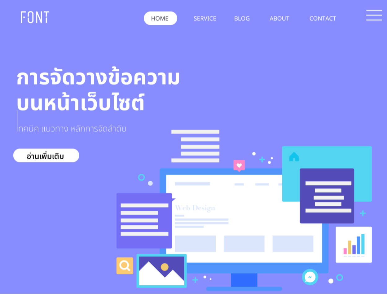
Placement of text on website pages
2023-10-20 09:43:16
Placement of text on website pages
Website text is very important because it is the first thing that is seen on your website. The design and layout of your website is very important. When your website is published It is very important that you align your rows to match the format for each country in which your website is published. To be able to communicate clearly.
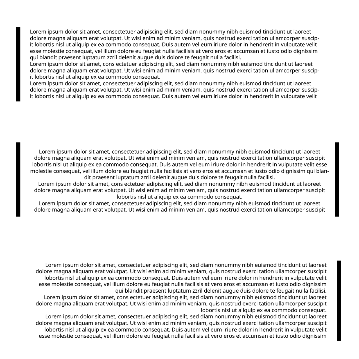
Text alignment is the positioning and direction of text in a shape or text box. You can change the text to be left-aligned, right-aligned, centered, or aligned. You can also rotate or flip the text. and adjust the margin between the text and the edge of the shape or text box. In lining up text on a website, align the position and direction of text on a web page. which affects communication and reading of users A website with well-organized text keeps the content organized, clear, and interesting.
The organization of text on a website can be done using HTML, which is the language used to create websites. HTML contains tags that are used to define the formatting of text, such as headings, paragraphs, style, alignment, references, and so on.

Guidelines for lining up text in different countries
The ordering and direction of text on a page or screen depends on the language, culture, and popularity of the population in each country. The arrangement of text affects communication and reading by users.
Some countries have different text arrays than most of the world, for example:
-Countries that use languages that are written from right to left, such as Arabic, Hebrew, Farsi, and others, align text to the right. and arrange pages from right to left
-Countries that use languages that are written from the top down, such as China, Japan, and Korea, have their text lined up close to the top. and in order from right to left
-Countries that use languages that have a mix of top-down and left-to-right writing, such as Myanmar, have their text aligned to the top. But sorted from top to bottom.
In addition to arranging text rows, There are other techniques. That helps you line up your text beautifully:
-Using bold, italic, or underlining. to emphasize important messages or to separate text into different parts
-Using text colors to create interest or to show the meaning of the message, such as red for errors. green for results
-Using distance to divide paragraphs or to increase the conciseness of the message
-Reference use or bibliography
-Using a list to display a list of messages, such as
-point list
- Point one
- Second point
- Third point
-Sequential list
- Step one
- The second step
- Step three
The layout of the text rows may always be designed to match the design of the website. Therefore, there is no clear guideline for placement. It is considered freedom in website design. However, one must consider the reading methods of the target audience in each area. This is considered a basic matter for web designers.
Leave a comment :
Recent post

2025-01-10 10:12:01

2024-05-31 03:06:49

2024-05-28 03:09:25
Tagscloud
Other interesting articles
There are many other interesting articles, try selecting them from below.

2024-03-22 03:12:18

2024-09-04 11:56:27

2025-02-20 10:33:11

2024-01-31 04:17:33

2024-04-03 09:23:33

2025-05-16 10:26:51

2024-06-10 11:37:20

2024-08-07 10:34:48

