Choose color pairs to design UI pages.
2023-10-17 04:05:22
Choose color pairs to design UI pages.
In UI design, the beauty of a website's pages is important. It is very much that must be considered at the top because it will create the first impression. The choice of colors that will express one's identity and the uniqueness of the website page Using a pair of colors that are opposite to the selected color will help promote the selected color to stand out more. Many factors must be taken into account. Brand image What you want to communicate User context and appropriate color
How to choose a color pair
1. Understand brand colors
Choosing a color pair for your UI page design should start with understanding your brand colors. Brand colors are colors that will make users remember and associate with you, such as Coke's red, Facebook's blue, McDonald's yellow, etc. Brand colors are primary colors. Used with Components that users interact with the most, such as links, buttons, or icons.
2. Choose the appropriate color tone.
Color tone is the adjustment of Hue (color value), Saturation (color saturation), and Brightness (color brightness) to obtain different colors at the appropriate level or intensity.
Color schemes help differentiate the product and add beauty to the UI.
Choosing the right color tone depends on many factors, such as:
-User goals: If users want a quick, stimulating action, such as stock trading or gambling, you should use warm tones such as red, orange, or yellow to encourage action.
-User's gender: If the user is male. You should use dark tones such as grey.
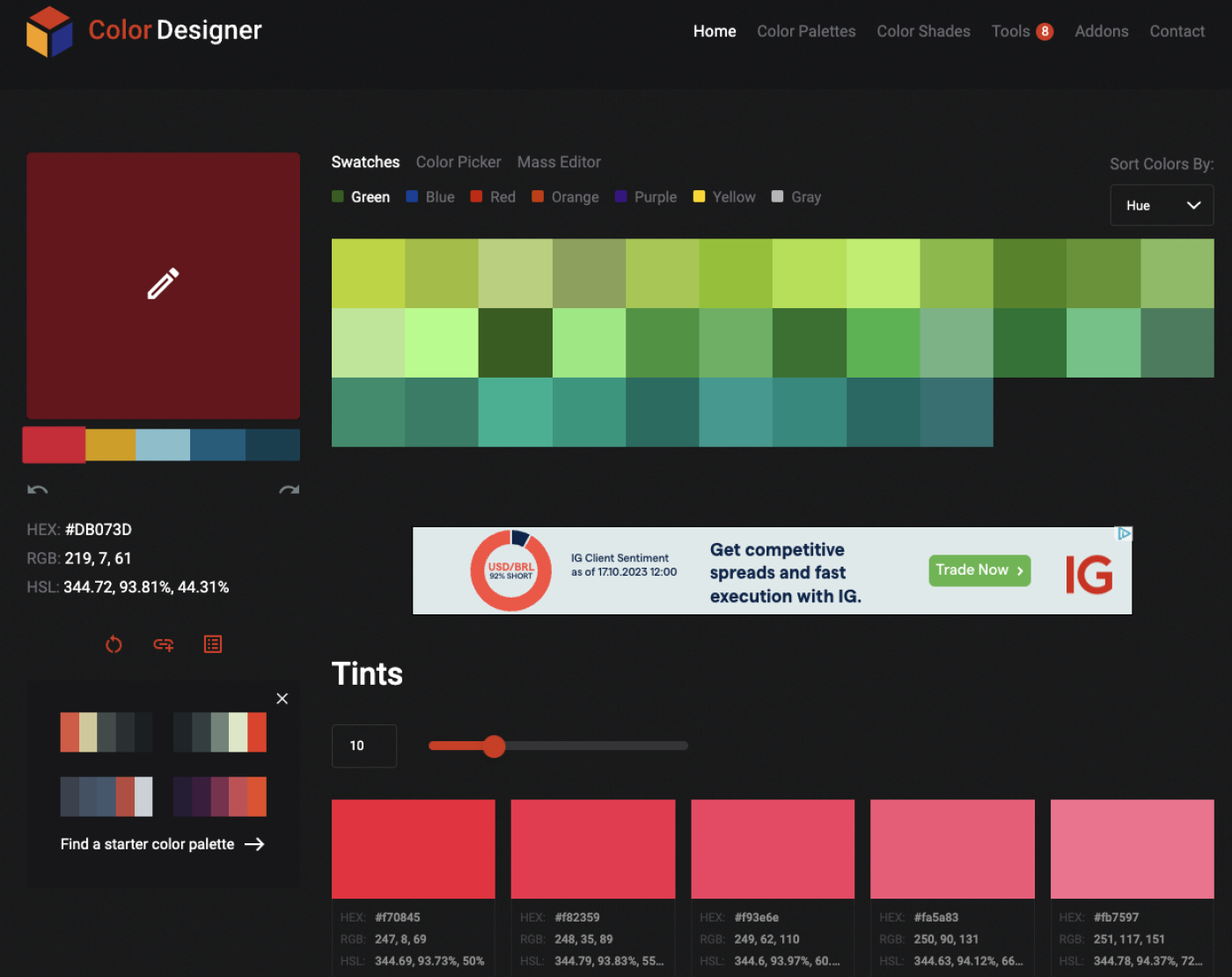
Another tool that can help with matching colors is the Color Designer, a tool that helps you create beautiful color schemes and customize them however you want. You can select a base color and adjust its hue, saturation, and brightness. The tool will display colors that are harmonious with the base color using color wheel principles such as complementary, analogous, triadic, tetradic, split-complementary, square, monochromatic, and custom
strength
-Colors can communicate the emotion, meaning, and trustworthiness of a website.
-Color can increase the interest, impression, and memory of the user.
-Colors can highlight important elements, such as buttons, menus, or icons.
-Color can help a design look systematic, cohesive, and unique to your brand.
weakness
-Using too much or inappropriate color can make a design look cluttered, boring, or unclear.
-Using colors that do not match the context, goal, or user may cause confusion, mistakes, or dissatisfaction.
-Using colors that do not consider the visually impaired, such as text and background of the same color, may prevent users from seeing clearly.
-Using colors that do not consider culture, such as red in the West and East having different meanings, may cause misunderstandings.
In conclusion, choosing a color pair to design a UI page in UI design, the beauty of the website page is important. Brand colors are the main colors.
Leave a comment :
Recent post

2025-01-10 10:12:01


2024-05-31 03:06:49

2024-05-28 03:09:25
Tagscloud
Other interesting articles
There are many other interesting articles, try selecting them from below.

2025-05-09 03:40:39

2024-06-17 04:16:51

2024-04-30 03:29:35

2024-09-25 05:02:38

2025-01-28 10:39:57

2023-11-23 01:40:59

2024-08-13 01:29:43

2024-04-01 02:48:03

2023-10-18 04:43:34