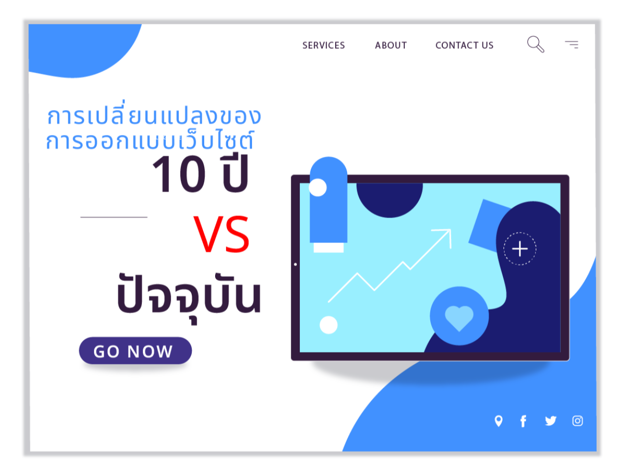
Website design changes 10 years ago vs. today
2023-10-18 04:33:37
Website design changes 10 years ago vs. today
As times have changed, the popularity of website design has evolved with the times. Being a good designer requires understanding past, present, and future trends in web design. This article will collect the differences between how websites were designed 10 years ago or 100 years ago and how they were designed by studying the past. Since the development of the website And currently, are there any popular trends?
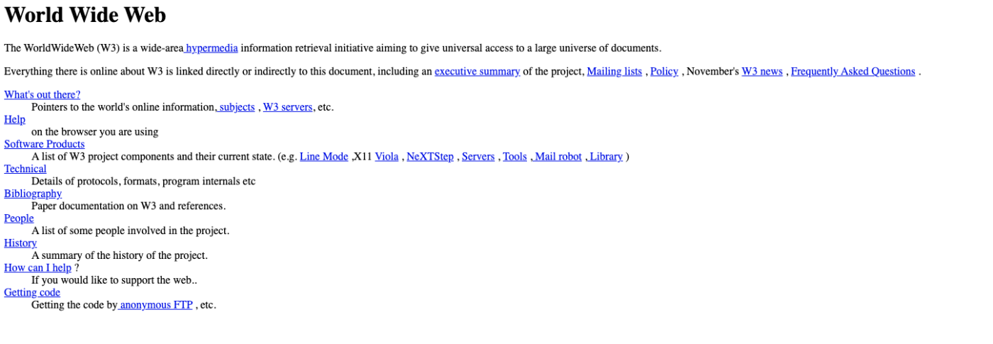
Web design from 10 years ago was 2013. During that time there were many interesting web design trends such as:
-Using full-screen images to create realism and impress visitors. Websites that use this trend are often hotel websites. tourist attraction or products that want to show off their features
-The use of typography is an important part of design. To convey the content and atmosphere of your website, using good typography will help your website look unique. and add interest
-Using flat design to simplify the design Websites that use a flat design do not have shadows, gradients, or bright colors. To keep the website looking clean and simple
-Using parallax scrolling to create dimension and movement in websites Websites that use parallax scrolling have the background and foreground change as the user scrolls. To create contact and fun
Differences between website design today and 10 years ago
-Use of colors: Ten years ago, websites used colors that reflected the identity of the brand or creator, such as white, yellow, red, green, etc. But nowadays Websites tend to use strong colors. or colors that change according to the environment or colors related to the user's mood, such as blue, purple, pink, etc.
-Use of images: Ten years ago, websites used vector-based images. or images that look cartoonish To make the website look fun and cute But at present Websites tend to use realistic images. or images taken from reality To make the website look trustworthy and realistic
-Use of Animation: Just 10 years ago, websites often used 2D or 3D animations to make the site look fresh and interesting. But at present Websites tend to use VR (Virtual Reality) or AR (Augmented Reality) animations to provide a better user experience.
“And if there was a website from 100 years ago, what would it look like?”

In 1923 there was no website or internet. Since the development of technology had not yet reached that stage and the first computer was created in 1937, it was based on the style of printing. and the popularity of architectural design during those years
-The website may use bright colors. or colors that are similar to the colors used in printing or the colors used in photography.
-The website may use geometric shapes. Strong and sleek lines convey elegance Looks like a trustworthy brand
- Websites may use typography design, which is designing websites using typography as an important part. To convey the message and atmosphere of the website.
-The website may use minimalism design, which is to design the website by reducing unnecessary details. Leave only what is necessary and important.
-The website may not use Flash to create a website that is highly interactive and animated because Flash is a technology developed after 1996.
-The website may not have a responsive design, which is designing the website so that the size and format of the website can be adjusted to suit the size of the screen that the user uses. Because at that time there were no devices that could access websites such as mobile phones or tablets.
Therefore, how a website design changed 10 years ago or a website 100 years ago is important information for web designers. Because of understanding the trend of Popularity during that time, whether it was 10 years ago or how many years have passed Learning from past styles can lead to design guidelines for development. or always refer to design methods
Leave a comment :
Recent post

2025-01-10 10:12:01

2024-05-31 03:06:49

2024-05-28 03:09:25
Tagscloud
Other interesting articles
There are many other interesting articles, try selecting them from below.

2025-03-12 01:51:41

2024-10-10 11:15:28

2023-12-27 01:48:59

2025-05-30 06:53:26

2023-11-15 09:30:13

2024-04-11 05:34:50

2023-11-07 09:46:31

2023-10-17 03:51:31

