
5 fonts that massima vignelli needs
2023-11-21 01:09:33
5 fonts that massima vignelli needs
Massima Vignelli is a famous designer from Italy. that has a principle in choosing limited fonts and believe that there is no need for new fonts To his credit, in 1991 he held an exhibition at the School of Visual Arts in New York, showing his designs using only four fonts: Garamond, Bodoni, Century Expanded, and Helvetica. In the book The The Vignelli Canon that he wrote in 2009-10 added two more of his favorite fonts: Futura and Times. So, in conclusion, Massima Vignelli's 5 preferred fonts are:
-Garamond
-Bodoni
-Century Expanded
-Futura
-Times
One of his design philosophies is the use of limited fonts. but high quality He once said "It's not a font. It's what you do with it that matters." He believes that good fonts are limited. And most of the new fonts are improvements to the original fonts.2 He once revealed that he only works with six fonts: Garamond, Bodoni, Century Expanded, Futura, Times, and Helvetica.
In this article, we'll take a look at each of these fonts' characteristics, history, and uses.
Garamond

Garamond is a serif font that is beautifully shaped, balanced, and highly readable. This typeface is more than 400 years old and is credited to the 16th century French typographer Claude Garamond. It is used in many publications, such as books, magazines, and logos. For example, the logos of Google and Apple use the typeface. Garamond font
Bodoni
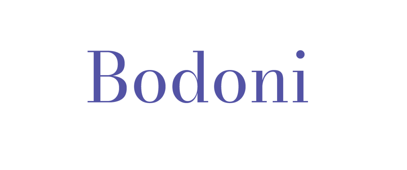
Bodoni is a serif typeface with contrast between thin and thick lines. and has smooth serifs The font was created by Giambattista Bodoni, an Italian typographer, in the 18th century. It is used in designs that are sleek, modern, and unique. For example, the logos of Vogue and Calvin Klein use the Bodoni font.
Century Expanded
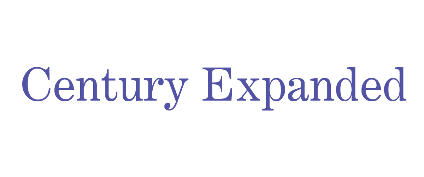
Century Expanded is a serif font with even line thickness. And there are serifs that are shaped like crab claws. This font was created by Linn Boyd Benton and Morris Fuller Benton in the 19th century. It is used in books, magazines, and other publications that require readability. For example, The New Yorker magazine uses the Century Expanded font.
Futura

Futura is a sans-serif typeface with linear, right-angled, and symmetrical shapes. Created by German designer Paul Renner in the 20th century, this typeface is used in designs that are simple, clean, and modern. For example, the Volkswagen and FedEx logos use the Futura font.
Times

Times is a serif font with variable line thickness. And there are serifs that are shaped like thorns. This typeface was created by Stanley Morison and Victor Lardent during the 20th century.
Leave a comment :
Recent post

2025-01-10 10:12:01


2024-05-31 03:06:49

2024-05-28 03:09:25
Tagscloud
Other interesting articles
There are many other interesting articles, try selecting them from below.

2024-10-18 01:36:48


2024-04-30 04:47:37

2024-01-19 04:16:55

2024-03-19 09:28:34

2023-10-03 01:55:58

2024-02-21 05:04:05

2023-12-12 04:56:33

2024-03-08 04:53:01