Designing notification windows on websites
2023-10-20 09:48:57

Designing notification windows on websites
Notification windows on websites are a part of the UX (User Experience) design that is responsible for informing the user about the status. changes or actions that occur on the website, application, or extension that the user is using These notifications can help users stay on top of important things happening on the website they are signing up for.
The importance of notification windows
- Increase efficiency and user satisfaction Notifications help users never miss important information, events, or updates. and help users make accurate and quick decisions.
-Increase user engagement and purchases Notifications help users recognize the value, usefulness, and appeal of the website, app, or extension they're using. and help motivate users to take desired actions.
-Increases user trust and safety Notifications help users know about the health status, errors, warnings, or irreversible actions of the website, app, or extension they're using.
However, some notifications may distract users, such as unrelated notifications. High-frequency notifications or notifications that are misleading in nature To prevent these problems Your notification window should be designed to look like this:
-Follow good design guidelines, such as using appropriate colors, sizes, and text formats.
-Follows good usability principles, such as giving users the option to turn off, adjust, turn on/off, or delete notifications.
-Follows the principles of good communication, such as using language that is clear, easy to understand, and does not cause confusion.
-Follows the principles of good responsibility, such as not using notifications to advertise, threaten, demand, or commit illegal acts.
Notification window color
The color of notification shades on a website is an important aspect of creating a good user experience. The right colors help your notifications stand out, be meaningful, and not distract the user.
There are no exact rules about what colors should be used in notifications. But there are general principles that should be followed, such as:
-Use colors that match the style of the website. and does not clash with the background color
-Use colors that convey the severity, urgency, or feeling of the notification, e.g.
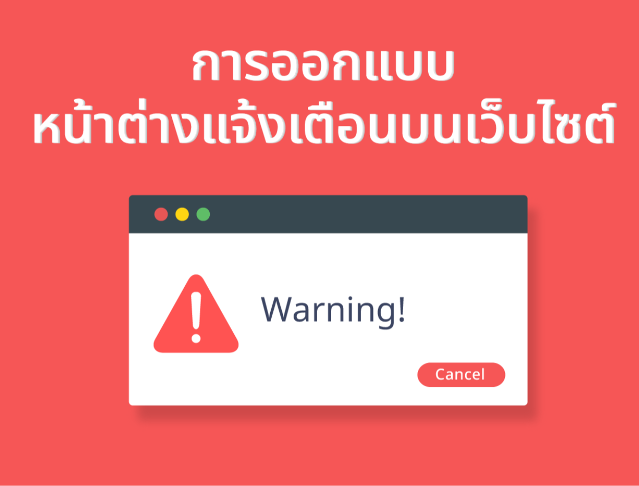
-Use red or orange to alert users to errors, warnings, or irreversible actions.
-Use green or blue to notify users about success, confirmation, or correct action.
-Use yellow or purple to alert users to unnecessary information, tips, or actions.
-Use colors that are sharp and easy to read. When adjusting the brightness and contrast of the background color and text
And if the website is red, what color should the notification window be?
If the website is red It is best to use colors that are compatible with red. and does not make the website look disturbing or compete with the color red, for example
-White, black, or gray are colors that go with everything. And it will help the content on the web look clear and sharp.
-Pink, purple, or blue are colors that are in the same tone as red. And it will help the website look warm and lively.
-Green is the color opposite to red on the color wheel. and will help the website look outstanding and impressive
-Gold is a color that is luxurious and precious. and will help the website look quality and stability
The notification window is very important. Because it increases efficiency and user satisfaction. Notifications help users never miss important information, events, or updates. Designing notification windows on websites Notification windows on websites are a part of UX (User Experience) design that is responsible for informing users about their status. and helping users make accurate and quick decisions.
Leave a comment :
Recent post

2025-01-10 10:12:01


2024-05-31 03:06:49

2024-05-28 03:09:25
Tagscloud
Other interesting articles
There are many other interesting articles, try selecting them from below.


2024-10-18 02:13:22

2024-04-11 02:14:04

2024-11-25 01:57:06

2023-10-04 02:32:16

2025-05-13 09:11:14

2024-08-13 02:24:11

2024-06-10 11:37:20

2023-10-18 04:29:02