
The technique of using color for effective communication through graphics.
2024-10-10 10:45:27
The choice of colors in graphic design plays a crucial role in conveying the meaning and emotions of the work. Colors can make viewers feel warmth, coolness, or excitement, depending on their use. Proper use of colors thus helps ensure that communication through design is focused and highly effective.
Know the meaning of colors (Understand Color Psychology)
Colors can evoke various emotions and feelings, known as "color psychology." Understanding the meanings of colors will help designers choose colors that align with the feelings they want to convey.
- Red: Represents energy, excitement, and passion. Often used to attract attention.
- Blue: Represents reliability, calmness, and stability. Often used in businesses that want to convey trustworthiness.
- Green: Associated with nature, health, growth, and balance. Often used in works related to the environment or health.
- Yellow: Represents happiness, brightness, and positive energy. Used to attract attention and enhance positive feelings.
- Black: Represents elegance, luxury, and mystery. Used in designs that aim to emphasize professionalism.
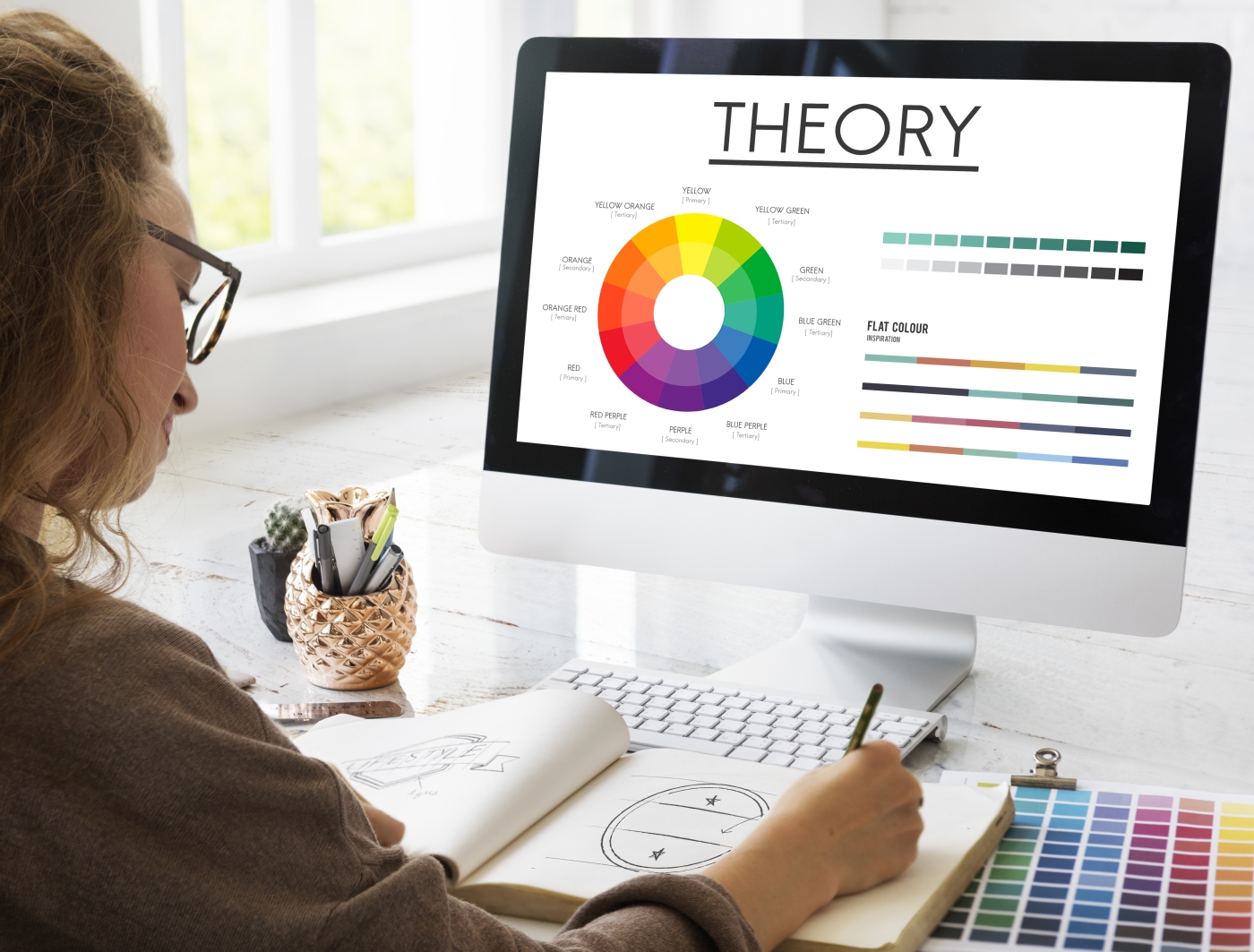
Use colors according to the color theory. (Apply Color Theory)
Color theory is an important tool for designers in selecting harmonious color pairs or creating a contrast to highlight key points. This technique can be divided into several main groups, such as:
- Complementary Colors: Colors that are opposite each other on the color wheel, such as blue and orange or red and green, which create contrast and attract attention.
- Monochromatic Colors: Use shades of the same color in various intensities to create a sense of consistency and emphasize simplicity.
- Analogous Colors: Colors that are next to each other on the color wheel, such as green and light blue, create harmony and a natural feel.
- Triadic Colors: Choose colors that are evenly spaced on the color wheel, such as red, yellow, and blue, to create balance while maintaining vibrancy.
Highlight important points with color. (Use Color for Emphasis)
Using colors that stand out more than other parts in a design helps emphasize important points that you want the audience to pay attention to, such as buttons on a website, main headings, or important messages.
- Using contrasting colors: Create a difference between elements, such as using dark colors on a light background to attract attention.
- Colors that contrast with the background: Use colors that differ from the background color to highlight important text or images.
Choose colors according to the target audience. (Tailor Color Choices to the Audience)
Choosing the right colors for the target audience is important because different age groups and cultures may have different preferences or interpretations of colors.
- Group of children: They often respond to bright colors such as yellow, red, and blue to create a sense of fun.
- Group of teenagers and adults: They often prefer more sophisticated colors, such as pastel tones, or colors that convey luxury like black and gold.
- Cultural design: Colors may have different cultural meanings. For example, white in some countries signifies purity, while in others it may signify mourning.
Use colors that align with the brand. (Maintain Brand Consistency)
For businesses and brands, the consistent and uniform use of color is crucial for building recognition.
- Choose brand colors: Create a unique primary color for the brand and use these colors in all marketing materials.
- Consistent color tones: Choose colors that convey the brand's image, such as luxury brands opting for black, gold, or silver, while brands focusing on vibrancy might use pastel or bright colors.
Using space in conjunction with color (Leverage White Space with Color)
Properly arranging white space helps the colors used in the design stand out without the need to use too many colors.
- Appropriate whitespace: Makes the design more organized and clear, without making the recipient feel uncomfortable.
- Emphasizing color with whitespace: Whitespace helps make the color used for emphasis stand out, such as a red button in a white space, which will attract more attention.
Testing colors in different contexts (Test Colors in Different Contexts)
Colors that look good on the screen may not be suitable when printed or displayed on other devices. Testing color reproduction on different media or devices is important.
- Color testing on various displays: Test colors on computer screens, mobile phones, or tablets to see if the colors communicate as desired in every situation.
- Printing: The colors displayed on the screen may differ from the printed colors. Testing should be conducted to ensure there are no discrepancies.

Choosing colors for graphic design to achieve good results requires knowledge of color psychology and color theory, as well as consideration of the target audience and brand consistency. Once these techniques are understood, designers can select colors that effectively communicate the message and evoke the appropriate feelings in the audience.
Leave a comment :
Recent post

2025-01-10 10:12:01


2024-05-31 03:06:49

2024-05-28 03:09:25
Tagscloud
Other interesting articles
There are many other interesting articles, try selecting them from below.

2024-12-16 11:31:42

2025-02-20 02:15:08

2024-09-25 04:38:33

2024-03-12 02:47:11

2024-03-21 02:39:57

2024-02-20 04:31:24

2023-09-06 11:30:44

2024-11-25 03:38:31

2024-08-06 10:34:57