15 UX design principles for seniors and people with disabilities
2023-10-11 09:59:45
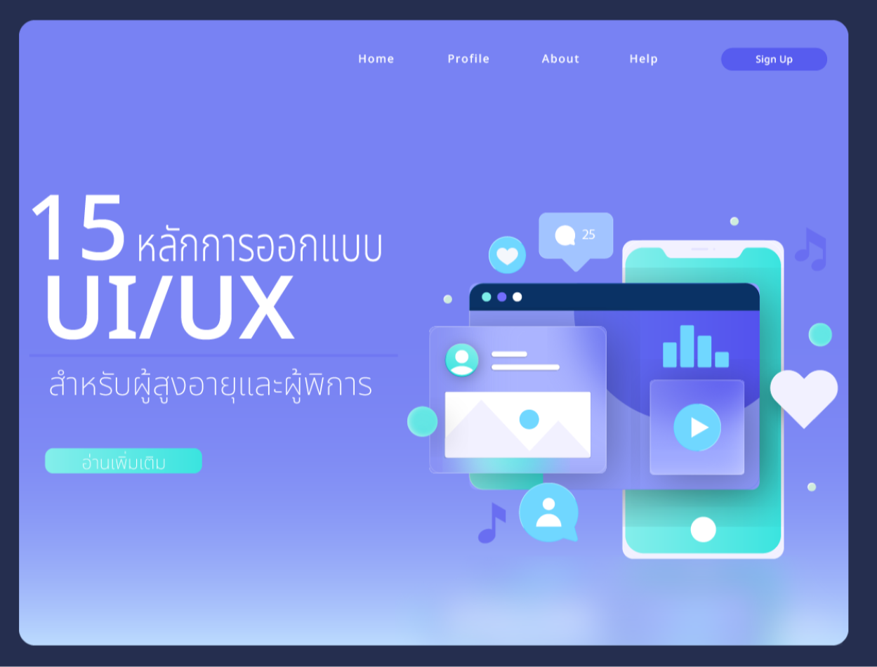
15 UX design principles for seniors and people with disabilities
It is very important to design website pages that are responsive to all target groups. In addition to the normal user group, There is another group that we must consider: the elderly and the disabled. UX design must support a system to assist the disabled and the elderly. There are 15 principles as follows:
1. Study the target group
In addition to studying the main user group, there must also be a study of other user groups and what they want. Are there any problems using methods to collect data for analysis? By interviewing users Conducting surveys directly to target groups Analyzing behavior and needs
2. There is a clear and easy-to-use navigation system.
Having a good and easy-to-use navigation system There is a clearly defined message that will be organized to support the target group. Increase the size of interactive elements like buttons, links, and form fields to make them easy to tap or click. Leave enough space to prevent accidental clicks.
3. Transcription and captioning
Video, music, and podcast content include transcripts and subtitles. for deaf people
4. Access the keyboard
Make sure that all elements are interactive and navigable using the keyboard.
5. Text displayed instead of images
Alternative text for images in the context of a response It is important to emphasize that all images, infographics, and graphics include meaningful alternative text for users who rely on screen readers.
6. Present information in a straightforward manner.
Show required content and provide options to access detailed information or advanced features as the user scrolls or interacts. This prevents users from having too much information at once.
7. Fonts that are easy to read
Use appropriate fonts and font sizes. A basic font size of at least 16 pixels (px) for body text is a widely accepted standard for good readability. and allows users to adjust the font size manually.
8. Difference between letters and background
Text and background are contrasted to meet WCAG (Web Content Accessibility Guidelines) standards. This generally means using dark text on a light background or vice versa. WCAG recommends at least a contrast ratio. 4.5:1 for standard text and 3:1 for large text against the background.
9. Supports people with color blindness.
Some users may have impaired color vision (color blindness). Avoid using colors alone to convey information. and use other symbols such as text labels or patterns.
10. Design that supports all sizes.
Can adapt to different screen sizes and devices. Make sure the message is still readable. Images have alt text. and interactive elements can be navigated via the keyboard.
11. Use CTA
Use clear and meaningful CTAs. That button they're going to press Buttons on touch interfaces should be at least 9.6 mm, 44 x 44 pixels on an iPad.
12. Reduce the cognitive burden
Keep the interface simple and focused. Avoid overloading users with too many options or distractions on the screen.
13. There is an easy-to-use form to fill out.
If your website has a form Designed to be easy to use Reduce the number of fields that need to be filled in. Give clear instructions
14. There are instructions for getting started.
If your website requires user registration or account setup. Instead, offer a guided onboarding process with step-by-step instructions and minimal input. Help users create an account or profile with a clear and concise form.
15. Test functionality
When you develop a website, each function must be tested.
-Test accessibility and navigation
-Test the screen reading program
-Test assistive technology
-Check instructions
- Test the usability of various devices
Leave a comment :
Recent post

2025-01-10 10:12:01


2024-05-31 03:06:49

2024-05-28 03:09:25
Tagscloud
Other interesting articles
There are many other interesting articles, try selecting them from below.

2024-04-25 09:31:48

2025-03-19 05:05:13

2024-09-10 10:41:53

2025-03-24 05:29:01


2023-10-31 03:54:19

2023-10-02 04:54:18

2025-05-09 03:40:39

2024-11-06 11:24:26