CSS Grid vs Flexbox: Differences and Appropriate Use Cases
2024-10-18 02:20:43
In the world of web design, CSS Grid, and Flexbox are essential tools for managing website layouts. Both techniques have different functionalities and are suitable for use in specific cases. Here is a comparison between CSS Grid and Flexbox, along with recommendations for appropriate usage.
CSS Grid
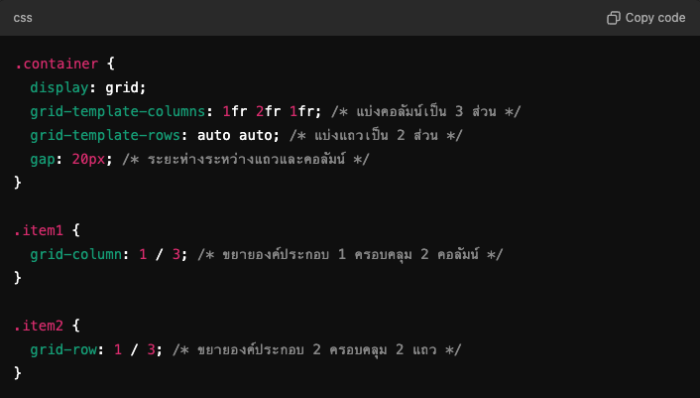
CSS Grid is a layout system that allows you to create complex structures easily and more efficiently, focusing on two-dimensional management (rows and columns).
The main features of CSS Grid:
- Two-dimensional structure: CSS Grid can arrange elements in both dimensions (rows and columns), making it suitable for creating complex layouts such as tables or data grids.
- Size control: You can clearly define the size of rows and columns, including the use of fr units that help manage space allocation flexibly.
- Easy arrangement: You can arrange elements within the grid using the grid-area property, which makes positioning easy and straightforward.
- Whitespace: Supports the management of whitespace between elements effectively, allowing for the creation of gaps between rows and columns.
When to use CSS Grid:
- When you want to create a complex layout, such as a data table, or arrange images in multiple columns.
- When you need to control the layout in both dimensions (rows and columns)
- In the case where the layout responds to different screen sizes (Responsive Design)
Flexbox
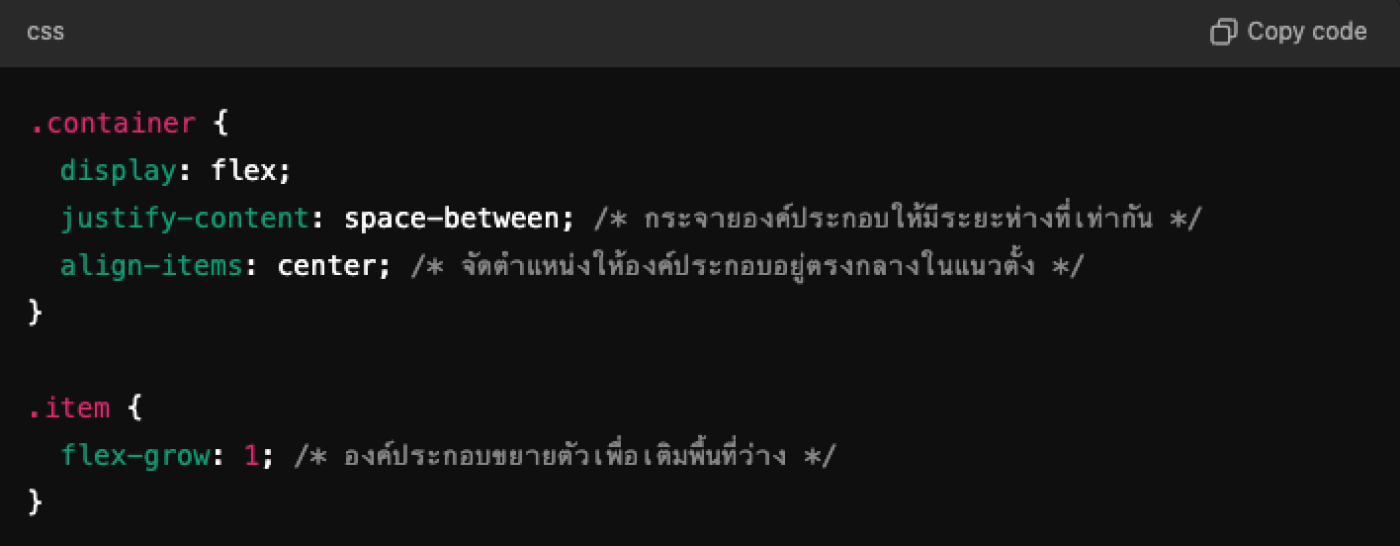
Flexbox (Flexible Box Layout) is a layout management technique that focuses on arranging elements in a single direction (one-dimensional), allowing the layout to be flexible and easily responsive.
The main features of Flexbox:
- One-dimensional structure: Flexbox works in a single direction (row or column), making it suitable for arranging items in a single line, such as menus, navigation, or boxes.
- Flexibility: You can define the size and position of elements flexibly using the properties flex-grow, flex-shrink, and flex-basis.
- Easy arrangement: Use the justify-content and align-items properties to quickly arrange elements without specifying exact sizes.
- Managing whitespace: You can easily manage whitespace within a Flex container using the gap property.
When to use Flexbox:
- When you want to arrange elements in a line, such as buttons in a box or a menu list.
- In case you want flexibility in arranging elements but do not want to create a complex structure.
- For creating responsive layouts, such as positioning icons or buttons in a menu bar.
Summary: CSS Grid vs Flexbox
- CSS Grid: Suitable for creating complex layouts in both dimensions, controlling the arrangement of rows and columns, and efficiently creating empty spaces.
- Flexbox: Suitable for arranging elements in a single line, providing flexibility and responsiveness. Easy to use when arranging items or boxes horizontally or vertically.
Both CSS Grid and Flexbox are powerful tools for web design. You can choose to use them according to the type of layout you want to create, and they can also be used together in the same project to achieve the best results.
Leave a comment :
Recent post

2025-01-10 10:12:01


2024-05-31 03:06:49

2024-05-28 03:09:25
Tagscloud
Other interesting articles
There are many other interesting articles, try selecting them from below.

2024-10-10 10:32:48

2024-03-29 01:11:30

2024-09-10 01:19:13

2024-11-25 02:38:18

2023-10-06 03:54:44

2024-08-13 01:29:43
2024-02-02 02:51:13


2024-12-16 11:31:42