
Online tools that help test the responsive design of websites
2024-10-18 03:09:39
Testing Responsive Design is crucial in creating a website that can adapt to multiple screen sizes, including mobile, tablet, and desktop. Nowadays, many online tools help you test whether your website works well on all devices. This is a popular online tool for testing the responsive design of websites:
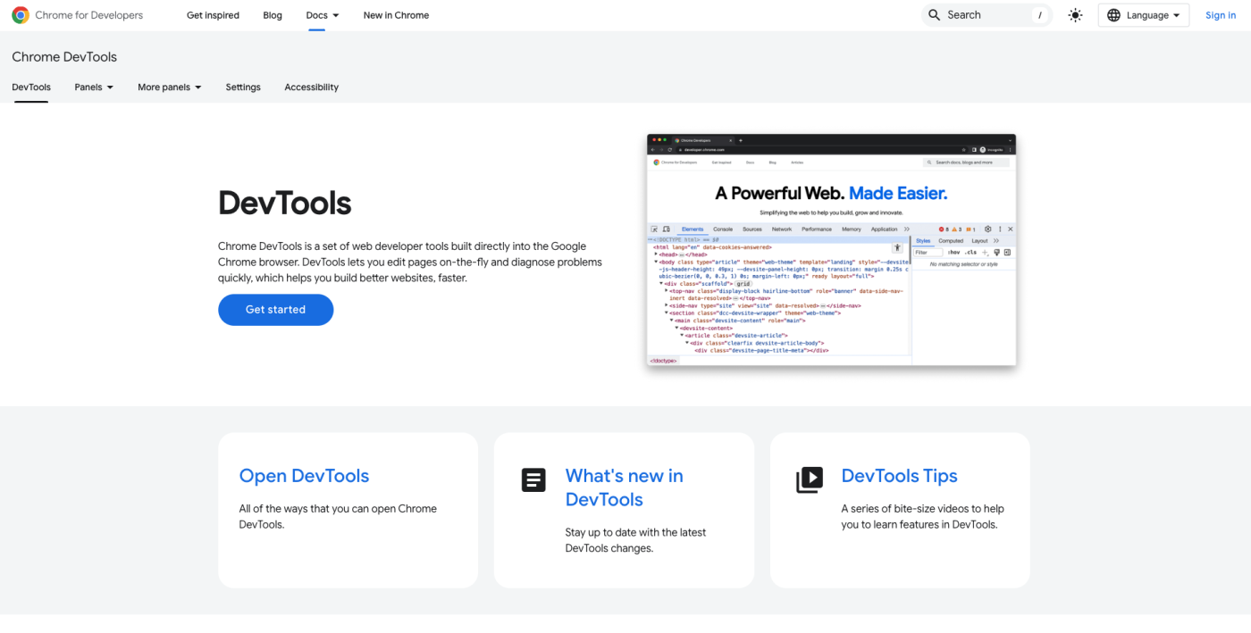
Google Chrome DevTools
Google Chrome DevTools is a tool that developers frequently use to test website responsiveness (Responsive Design) and also includes tools for simulating screens of various device sizes.
How to use:
- Open the website in Google Chrome
- Right-click on the webpage and select "Inspect" or press Ctrl + Shift + I (Windows) or Cmd + Option + I (Mac)
- Go to the mobile/tablet icon in the top right corner of DevTools to enter Responsive mode.
- You can choose different screen sizes or enter your size as needed.
Advantages:
- Available in the browser, no additional installation required.
- Can test multiple screen sizes immediately.
- There is a feature to simulate slow internet connections and performance testing.
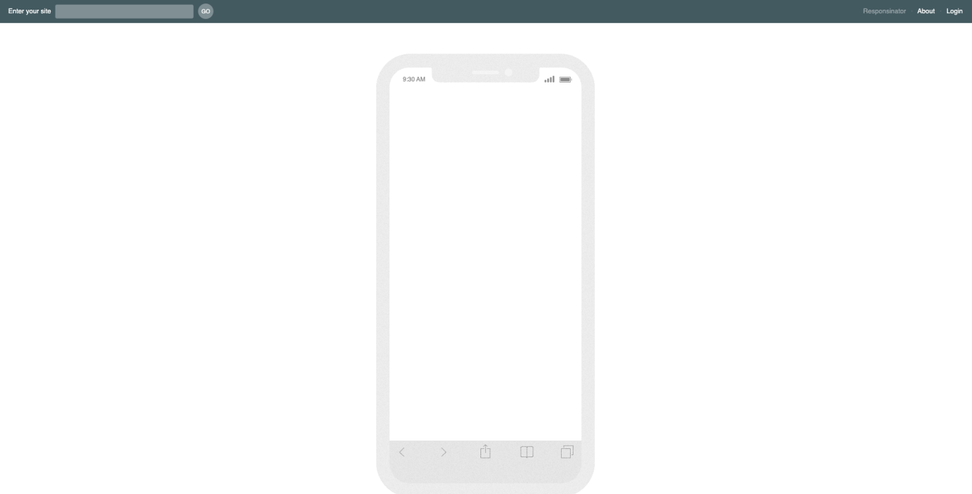
Responsinator
Responsinator is an online tool that allows you to easily view your website on various devices. Just enter the URL of your website, and the tool will simulate the display on screens of different sizes, such as iPhone, Android, iPad, etc.
How to use:
- Go to the Responsinator website
- Enter the URL of the website you want to test.
- View the website's display results on multiple devices.
Advantages:
- Easy to use, not complicated
- No need to install any programs.
- Supports multiple screen sizes for mobile phones and tablets.
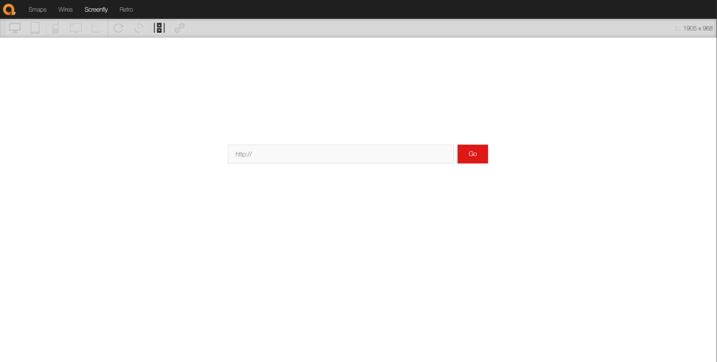
Screenfly
Screenfly is a Responsive Design testing tool that can simulate the screens of various devices in detail, from mobile screens to TV screens. Additionally, it allows for custom screen size settings.
How to use:
- Go to the Screenfly website.
- Enter the website URL.
- Select the type of device you want to test (Desktop, Tablet, Mobile, or TV)
Advantages:
- Supports rendering simulation on multiple devices, including TVs.
- There is a feature to choose the screen size yourself.
- Can be tested both vertically and horizontally.
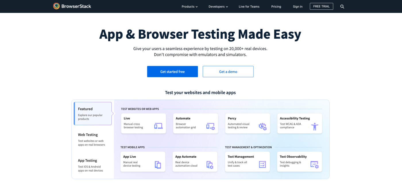
BrowserStack
BrowserStack is a cloud-based website testing tool that allows you to test the functionality of your website on various devices, such as iPhone, Android, or tablets. BrowserStack simulates the working environment of different devices and browsers, enabling you to see your website on every platform.
How to use:
- Go to BrowserStack
- Register or log in
- Select the type of device and browser you want to test.
- Enter the website URL to start the test.
Advantages:
- Can be tested in the real environment of multiple devices.
- Supports testing multiple browsers on various devices.
- There is a feature for testing browser compatibility.
Disadvantages:
- You need to register and there are costs associated with a plan that is more than the free plan.

Responsive App
A Responsive App is an open-source tool that developers use specifically for testing Responsive Design. Its standout feature is the ability to display a website on multiple devices simultaneously on a single screen, which saves time during testing.
How to use:
- Download and install the Responsively App
- Open the app and enter the website's URL.
- View the website's display results on multiple screen sizes at once.
Advantages:
- View the website's display results on multiple devices simultaneously.
- Supports free usage and has a variety of features.
- There is a Hot Reload feature that allows you to see changes instantly.
LambdaTest
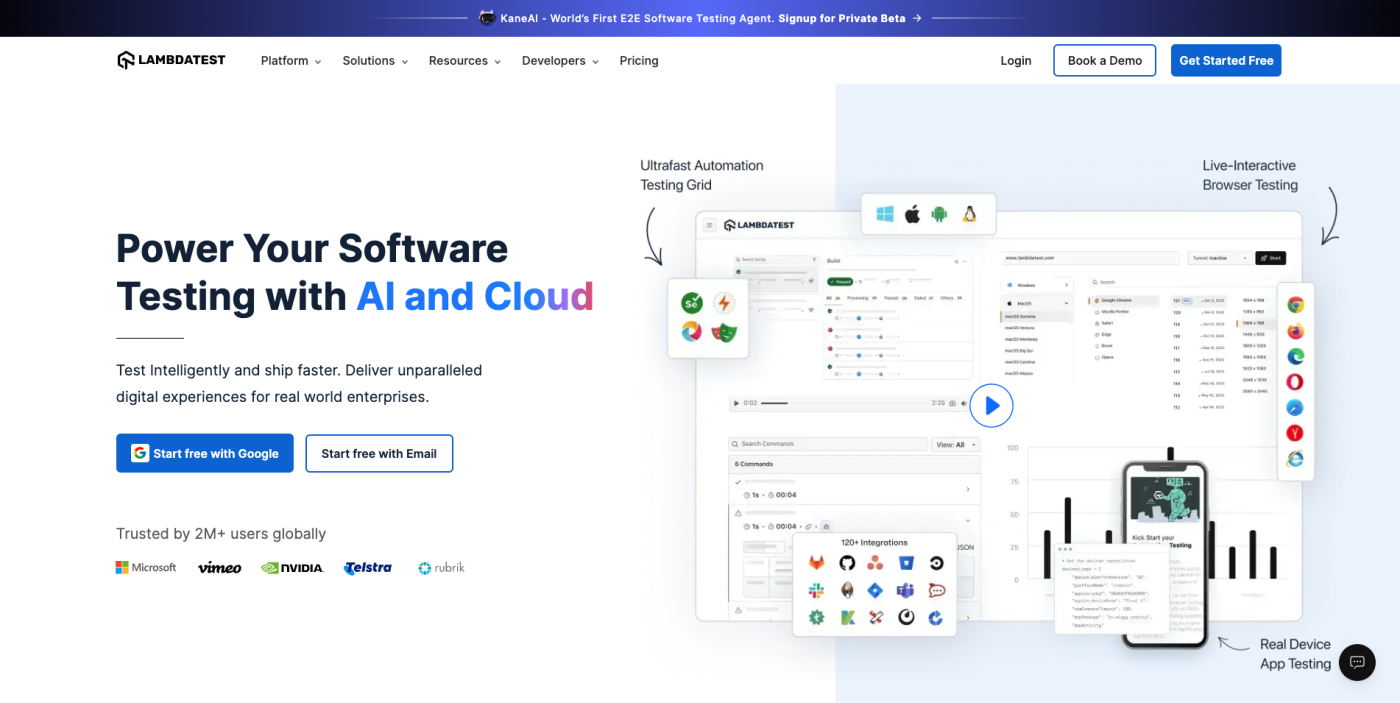
LambdaTest is a platform that allows you to test websites in an environment of multiple devices and browsers. LambdaTest supports testing in over 2,000 different browsers and has simulations for various mobile devices.
How to use:
- Go to LambdaTest
- Register or log in
- Select the device and browser you want to test.
- Enter the website URL to start the test.
Advantages:
- Supports testing on multiple devices and browsers.
- There is a simulation of various mobile devices.
- Supports compatibility testing and cross-browser functionality.
Choosing the right tool for testing the responsive design of a website depends on your needs. If you want simple and quick testing, Responsinator or Screenfly might be good options. But if you need more detailed and complex testing, BrowserStack or LambdaTest would be excellent choices.
Leave a comment :
Recent post

2025-01-10 10:12:01

2024-05-31 03:06:49

2024-05-28 03:09:25
Tagscloud
Other interesting articles
There are many other interesting articles, try selecting them from below.

2023-10-30 04:53:34

2023-11-01 02:54:29

2024-11-06 10:54:23

2023-12-12 04:45:33

2025-04-17 03:10:23

2023-06-20 12:47:03

2023-10-18 04:29:02

2024-12-16 09:41:15

2024-02-12 04:19:22
