CSS Animation adds interest to the website.
2024-10-18 02:43:35
Adding CSS Animation to a website is a great way to attract visitors' attention, make the site look lively, and create a memorable experience. By using appropriate movements, you can communicate messages and make users enjoy exploring the website's content. In this article, we will look at how to effectively use CSS Animation to enhance the website's appeal.
The basic workings of CSS Animation
CSS Animation is a feature that allows you to create animations for various elements on a website without using JavaScript. The working principle of CSS Animation consists of two main parts:
- Keyframes: Define the state of elements at each point of the animation
- Animation Properties: Set the duration, smoothness, and motion style.
Example of basic CSS Animation setup
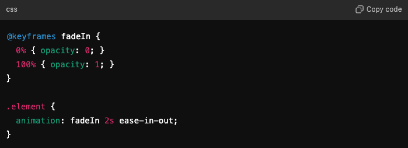
In this example, the element will gradually appear from transparent (opacity 0) to fully opaque (opacity 1) within 2 seconds.
Using Hover Animation
Adding animations when users hover (placing the mouse over an element) is a great way to create user interaction. Using these animations can effectively draw attention to important buttons or images.
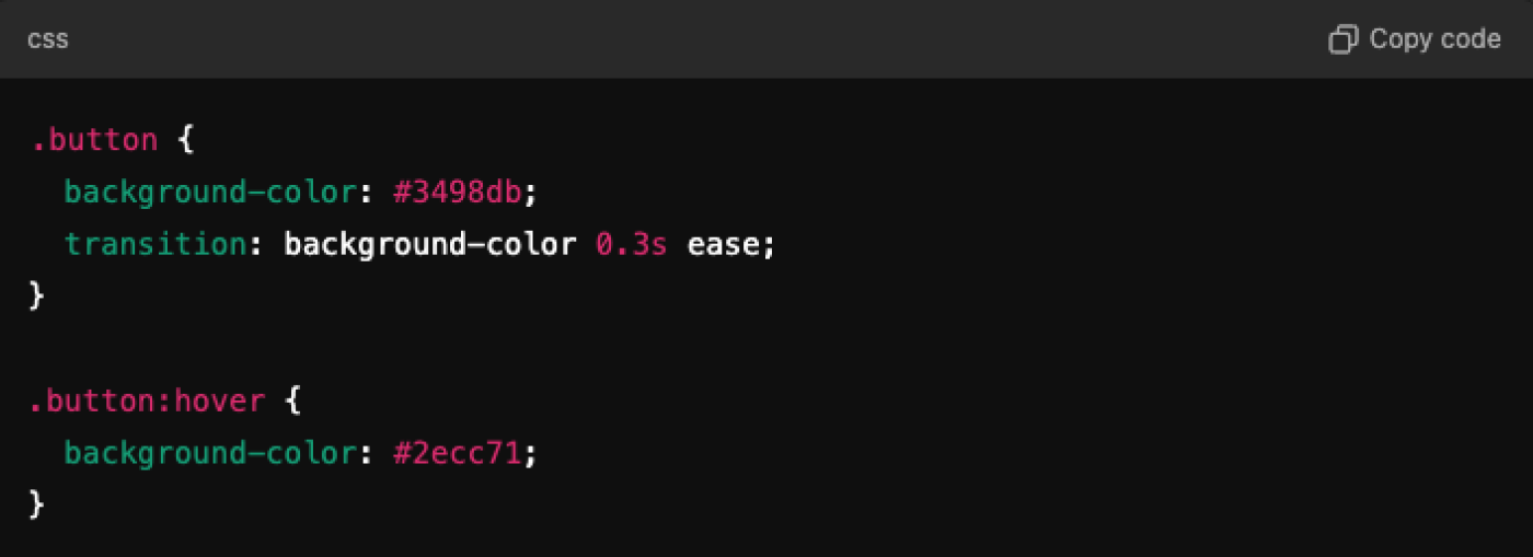
When the user hovers the mouse over the button, the button's color changes smoothly within 0.3 seconds, making the user feel that an interaction is taking place.
Loading Animation
Creating a loading animation helps users know that the website is processing or loading content. Using animation while loading makes the website look professional and reduces the feeling of boredom while waiting for the content.
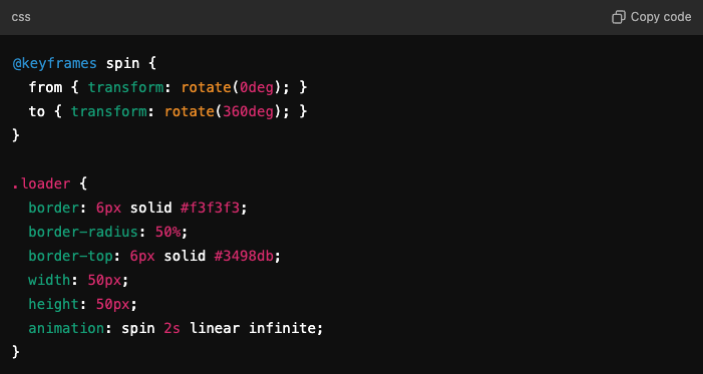
The result is a spinning circle icon that keeps rotating while loading data, helping users feel that the website is still working.
Text Animation
Using animations for text can help make important messages or the messages we want to stand out more, increasing their appeal. For example, making the text gradually appear or making the text move when scrolling through the page.
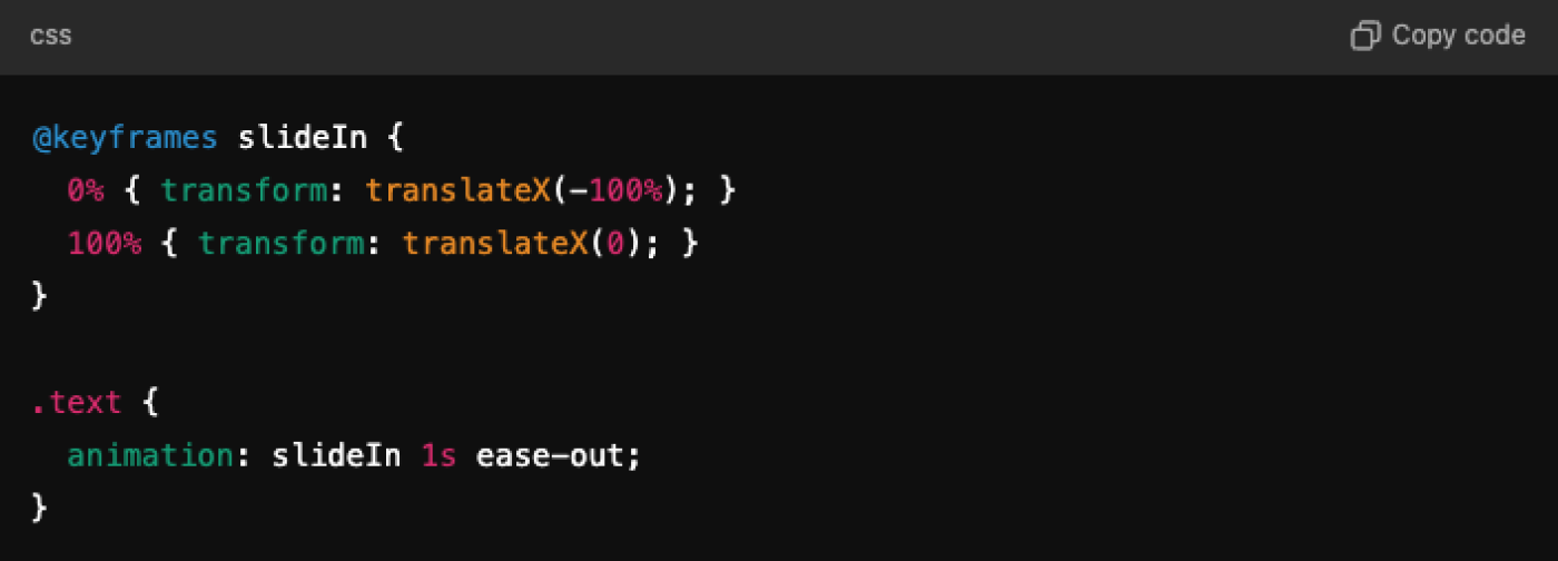
In this example, the text will slide in from the left to the position you want, which helps attract the user's attention.
Scroll Animation (Animation while scrolling the webpage)
Scroll Animation helps users feel the interaction while scrolling through the website. It can make content appear or move when users scroll down to that content's position. Proper use of Scroll Animation makes the website look modern and cohesive.
Example of using a simple scroll-triggered animation
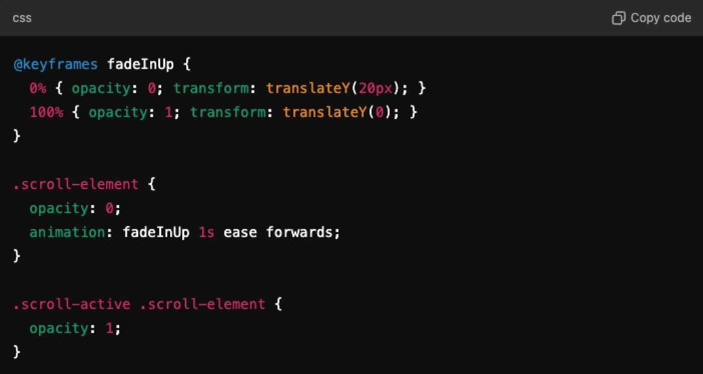
This animation will gradually slide the content up and make it appear when the user scrolls to it.
Button Click Animation (Animation when clicking the button)
Add animations when clicked. This helps users feel an immediate interaction and response from the website.
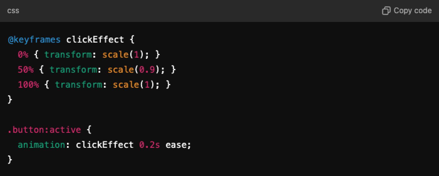
When the user clicks the button, it shrinks slightly and returns to its normal size in a short time, giving the user a real sense of pressing the button.
Parallax Effect with CSS
Parallax Effect is a technique that makes the background move slower than the foreground content, creating an illusion of depth and complexity in the design.

Using the Parallax Effect makes the website look three-dimensional and adds interest while scrolling.
The Use of Delay and Timing in Animation
Adjusting the duration and timing (delay and timing) of animations makes the website look more natural. These controls help create a distinction between smooth animations and those that appear too rushed.

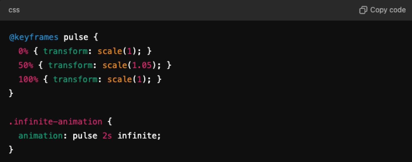
Infinite Animations for continuous movement
Sometimes adding continuous animations, such as spinning or color switching, can make certain content look lively, like a continuously spinning logo or a color-switching button.
Using CSS Animation Libraries
In addition to writing animations yourself, you can also use CSS Animation Libraries like Animate.css, which have ready-made animations that are easy to implement, such as spinning, sliding, and blinking, without having to write complex code.

Adding CSS Animation to a website not only makes it more interesting but also helps create a good user experience. Using animations in moderation will make the website look modern and unique.
Leave a comment :
Recent post

2025-01-10 10:12:01

2024-05-31 03:06:49

2024-05-28 03:09:25
Tagscloud
Other interesting articles
There are many other interesting articles, try selecting them from below.

2023-11-22 11:13:33

2023-10-30 04:35:37

2023-11-10 10:29:12

2023-09-25 04:09:33

2024-08-13 01:45:34

2024-03-29 10:32:46

2025-04-01 10:12:58

2025-02-26 11:32:09

