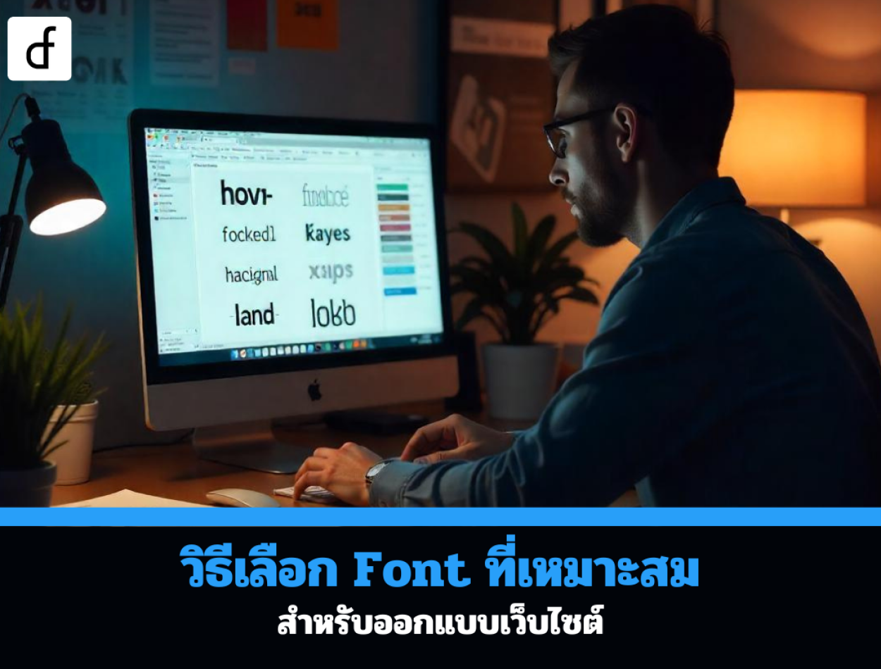
How to choose the right font: for website design
2024-10-10 09:11:40
Choosing the right font is a crucial element of website design because fonts play an important role in communicating the brand's identity and help create a good user experience for website visitors. Selecting the correct font makes the website look beautiful, enhances readability, and creates user interest. Here are some tips for choosing fonts for website design.

Choose a font that aligns with the brand. (Consistency with Branding)
The font chosen should align with the brand's image and identity. Selecting the appropriate font will help convey the desired emotions and feelings to the users, such as:
- Sans-serif fonts such as Arial, Helvetica, or Roboto are suitable for brands emphasizing modernity, simplicity, and professionalism.
- Serif fonts like Times New Roman or Georgia give a traditional, luxurious, or formal feel.
- Display fonts, such as script fonts or those with specific designs, are suitable for brands that want to create a distinctive and memorable impression.
Readability (Readability)
Good website design must take into account the readability of the font as a priority. A readable font will allow website visitors to quickly understand the content. Consider the following:
- Font Size: The font size should be large enough to read comfortably, especially on mobile devices. Generally, the font size for the main content should be 16px or larger.
- Line Height: The line height should be sufficiently wide to make reading comfortable. The standard value is approximately 1.5 times the font size.
- Color harmony between the font and the background: The font should be clear and sharp when placed on the background. Choose colors with high contrast, such as black font on a white background, to make it easy for users to read.
Limit the use of fonts (Limit the Number of Fonts)
Using multiple font styles on the same website can make it look cluttered and lack unity. It is advisable to limit the use of fonts to no more than 2-3 styles to maintain consistency and professionalism.
- Primary Font: Used for main content such as articles or general text.
- Secondary Font: Used for headings or sections that need to emphasize importance.
- Display fonts or special occasion fonts: Used only in cases where attention is needed, such as call-to-action buttons or large headings.
Supports fonts on all devices and browsers (Cross-Browser & Device Compatibility)
The chosen font must render well on all types of devices, whether it be a computer, tablet, or smartphone, as well as on various browsers such as Chrome, Firefox, Safari, or Edge. Using web-safe fonts like Arial, Verdana, or Tahoma will ensure that the font displays correctly on all browsers.
Use Google Fonts or high-quality free fonts.
If you need a variety of fonts that are free to use, Google Fonts is a great option. It offers a wide selection of fonts that are compatible with all browsers and allows for easy customization of size, weight, and style.
- Popular fonts from Google Fonts: Roboto, Open Sans, Lato, Montserrat, and Poppins are examples of highly popular and easy-to-read fonts.
- Other quality free fonts: Besides Google Fonts, there are other free fonts like FontSquirrel or DaFont that offer beautiful and versatile fonts.
Consider the font size and weight. (Font Weight & Size Variations)
Choose fonts with various weights and sizes, such as Thin, Regular, Bold, or Extra Bold, which will help you prioritize content more easily and make your website more interesting.
- Using bold font to emphasize text: Bold should be used in text that needs emphasis, such as headings or important buttons.
- Combining font weights in content: Use different weights to create a hierarchy of content, such as main headings, subheadings, and body text.
Check Thai language support
If your website uses both Thai and English, you should choose a font that can beautifully and easily display Thai text. Many fonts may look good in English but do not effectively support Thai text. Therefore, you should select a multilingual font, such as
- Thai fonts from Google Fonts: Noto Sans Thai, Sarabun, or Kanit
- Other free Thai fonts: TH Sarabun PSK or fonts from the National Font Project used in government agencies
Considering the website's loading speed
Using fonts with excessively large file sizes can slow down website loading, affecting user experience and SEO. You should use fonts with smaller file sizes and support file compression to ensure your website loads quickly.

Choosing the right font for website design affects the creation of a good user experience and also conveys the brand's identity. It is important to select a font that is easy to read, aligns with the business's image, supports display on all devices, and is suitable for long-term use.
Leave a comment :
Recent post

2025-01-10 10:12:01


2024-05-31 03:06:49

2024-05-28 03:09:25
Tagscloud
Other interesting articles
There are many other interesting articles, try selecting them from below.

2025-01-23 02:44:20

2024-08-19 10:58:38

2024-10-18 02:43:35

2025-04-04 11:31:32
2023-10-12 05:42:28
2023-10-17 04:05:22

2024-01-25 03:33:19

2024-02-29 03:13:26

2024-01-31 04:17:33